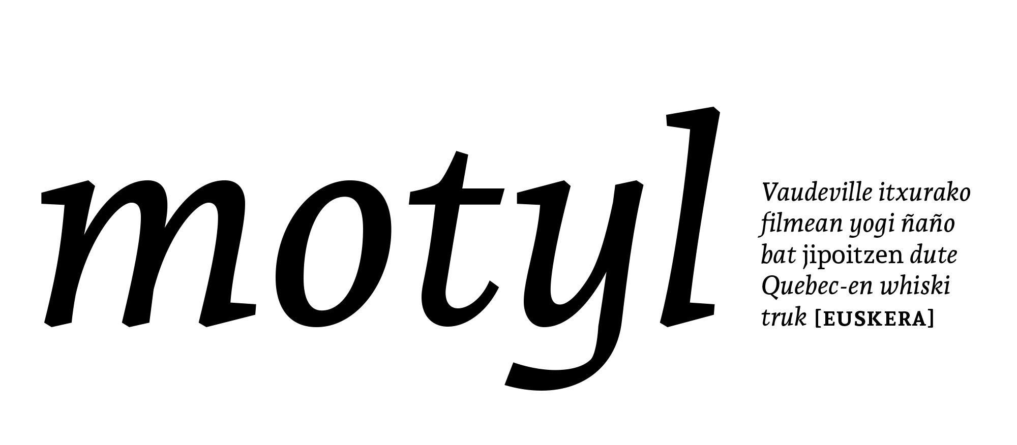
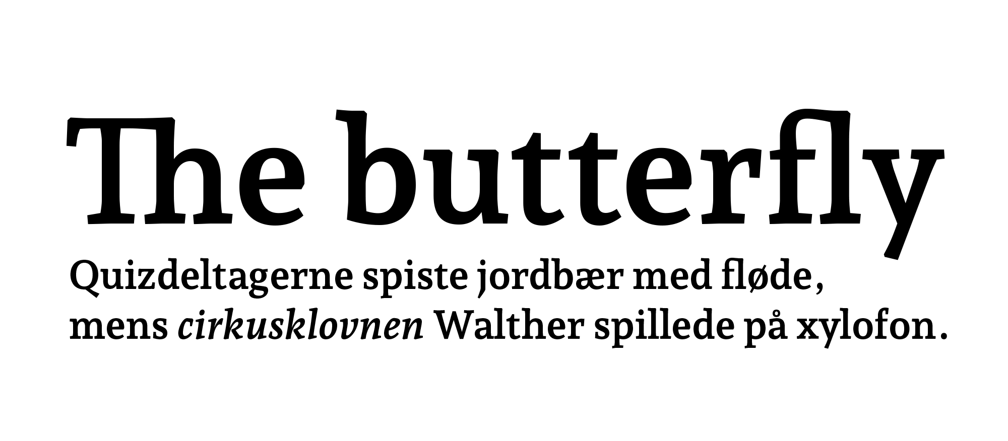
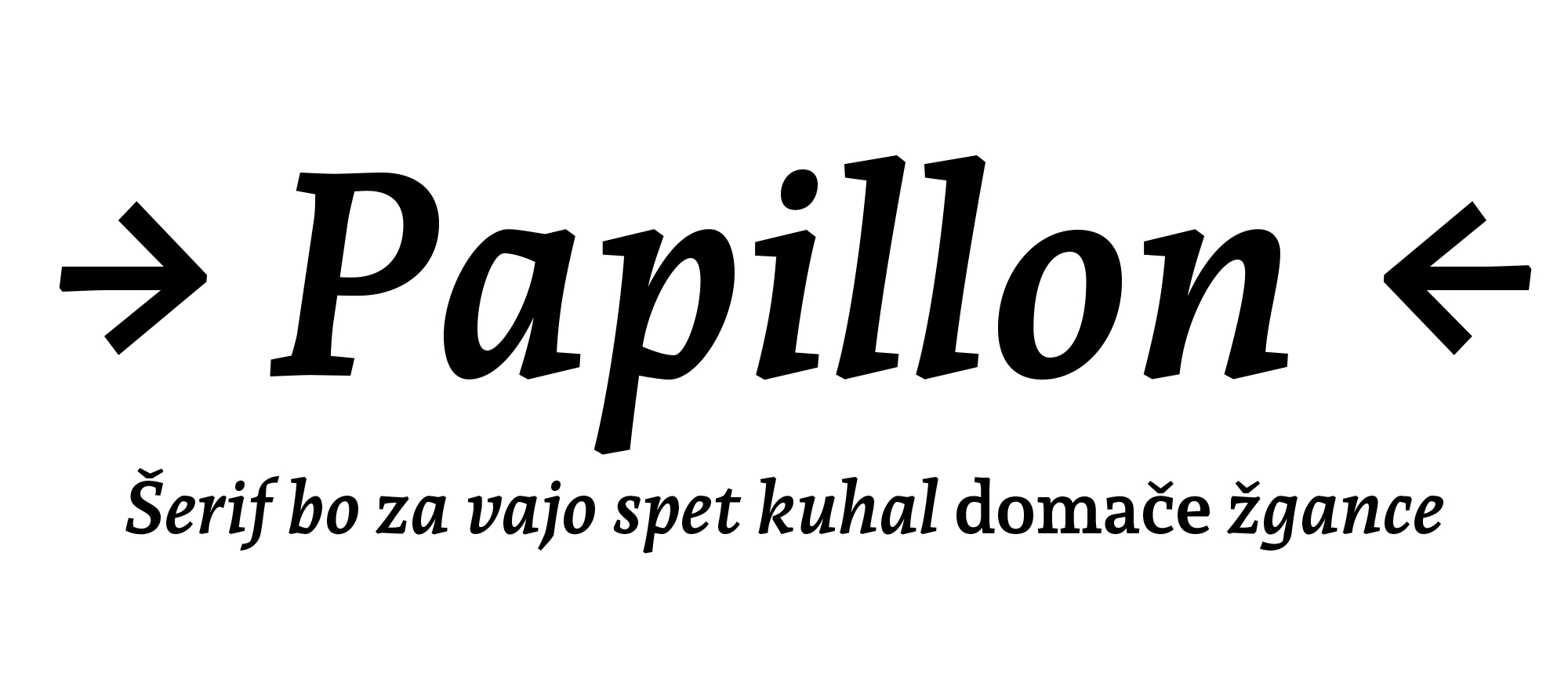
Andada - Regular
Andada - Italic
Andada - Medium
Andada - Medium Italic
Andada - Bold
Andada - Bold Italic
Andada - Extra bold
Andada - Extra bold Italic
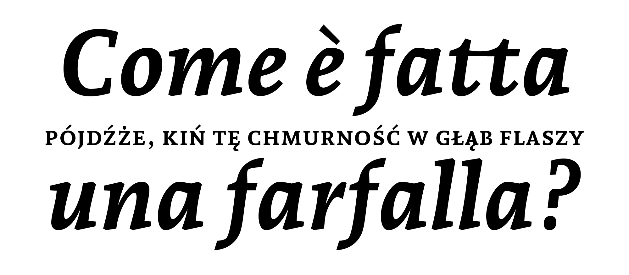
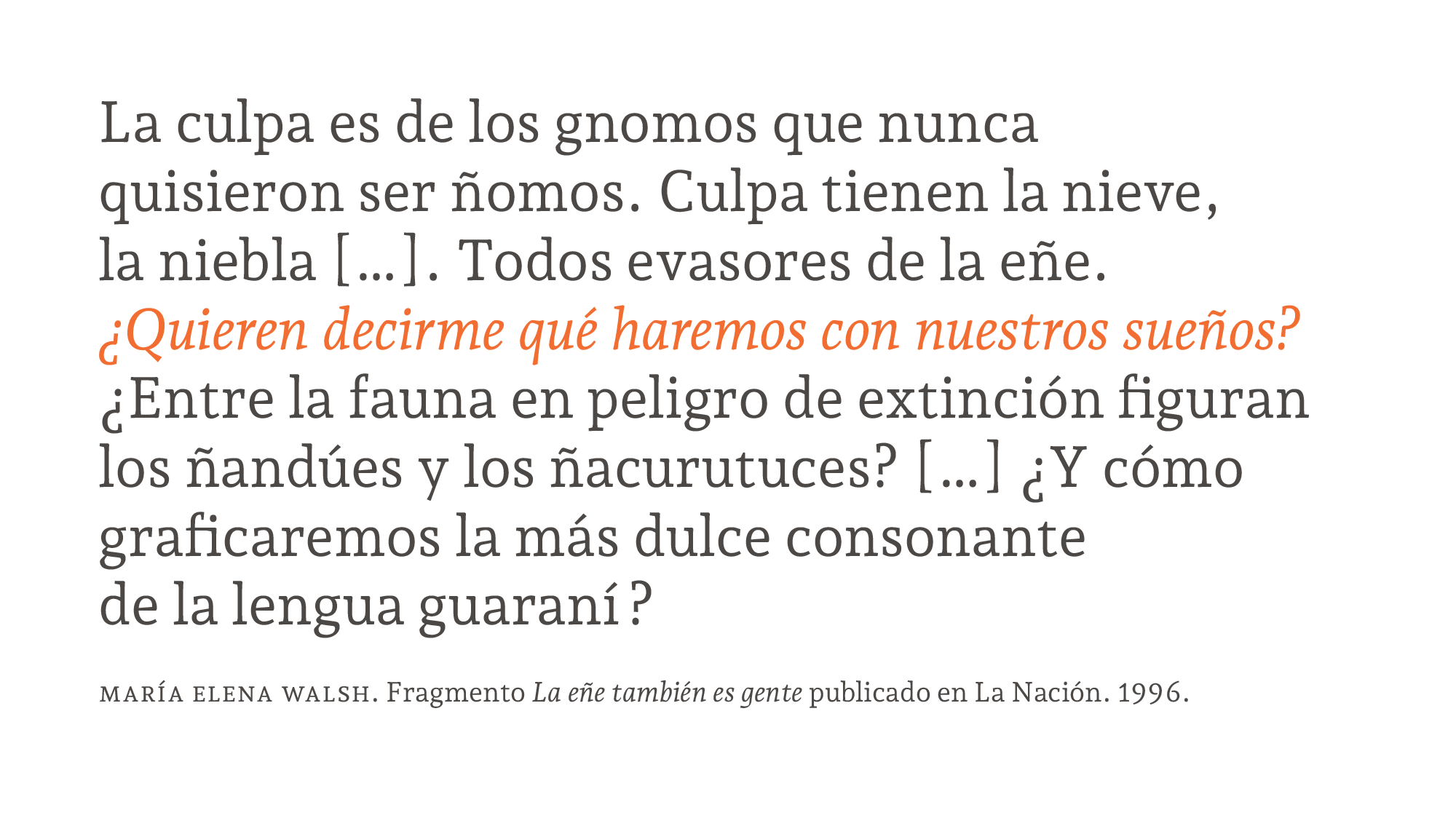
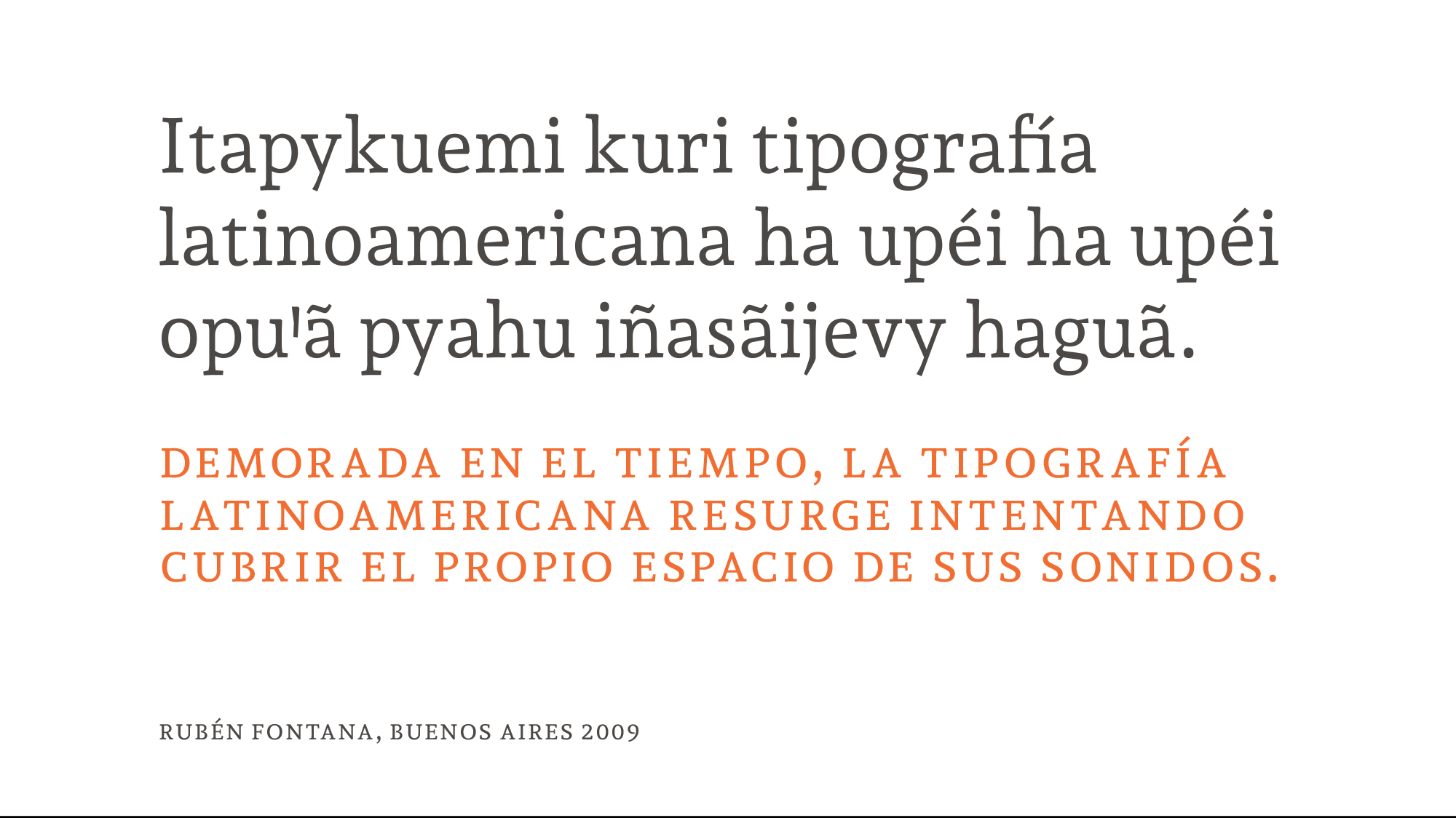
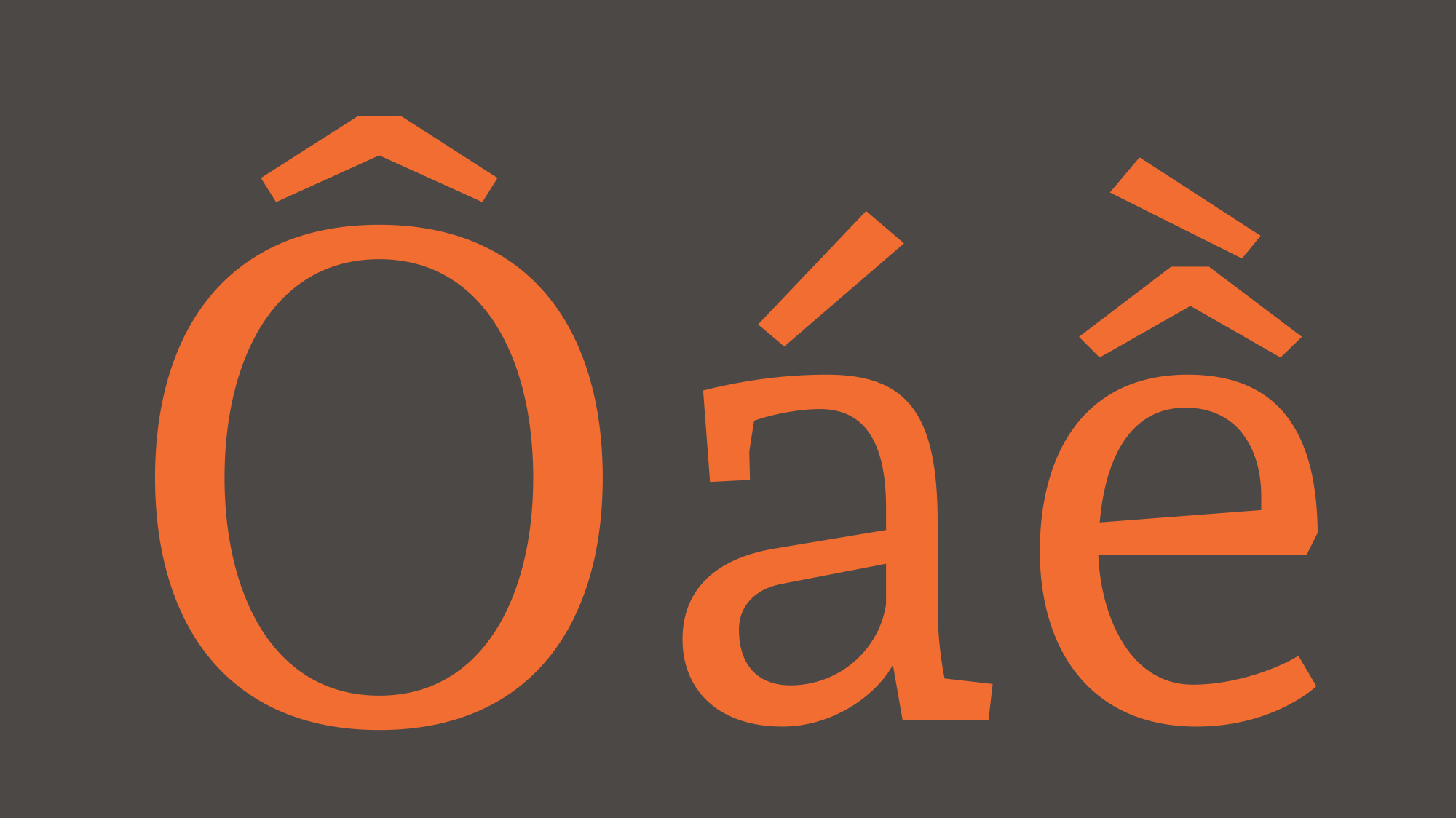
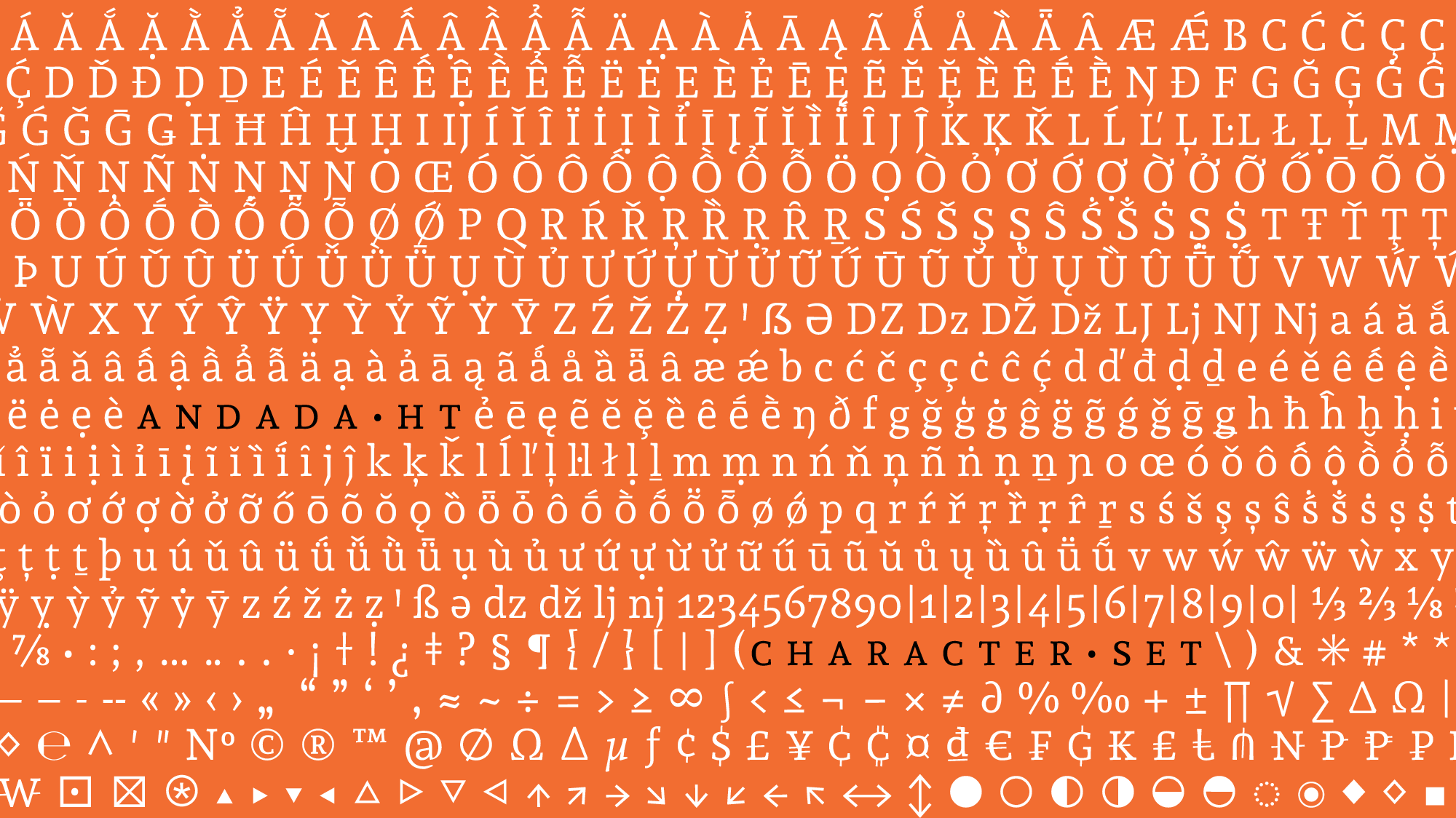
Andada was born from the relationship between language and typography. It is an organic-slab serif, hybrid style and medium contrast type for text. Initially it was designed to be used in a specific bilingual context — Spanish and Guaraní (pre-Hispanic) languages — so language is its design criterion.
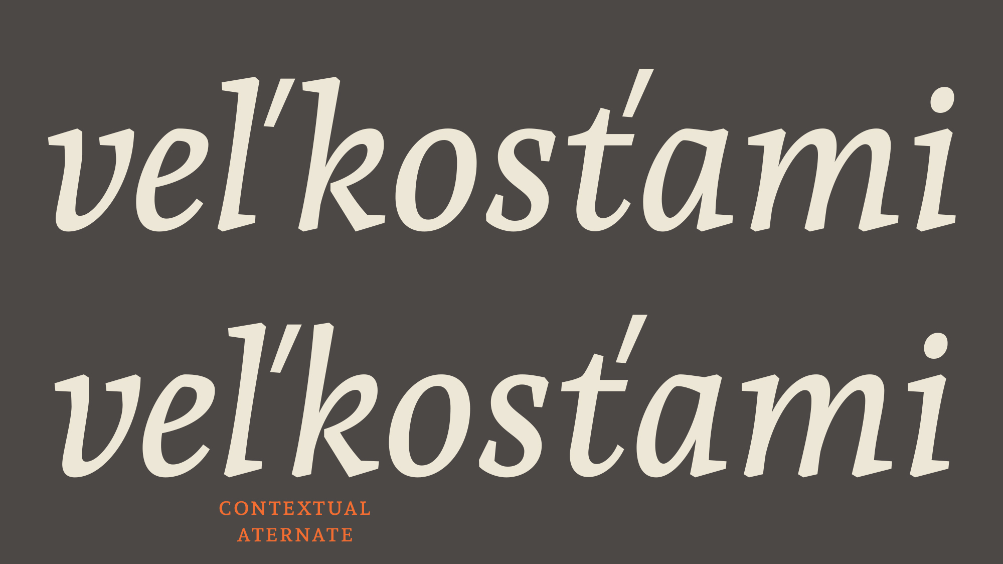
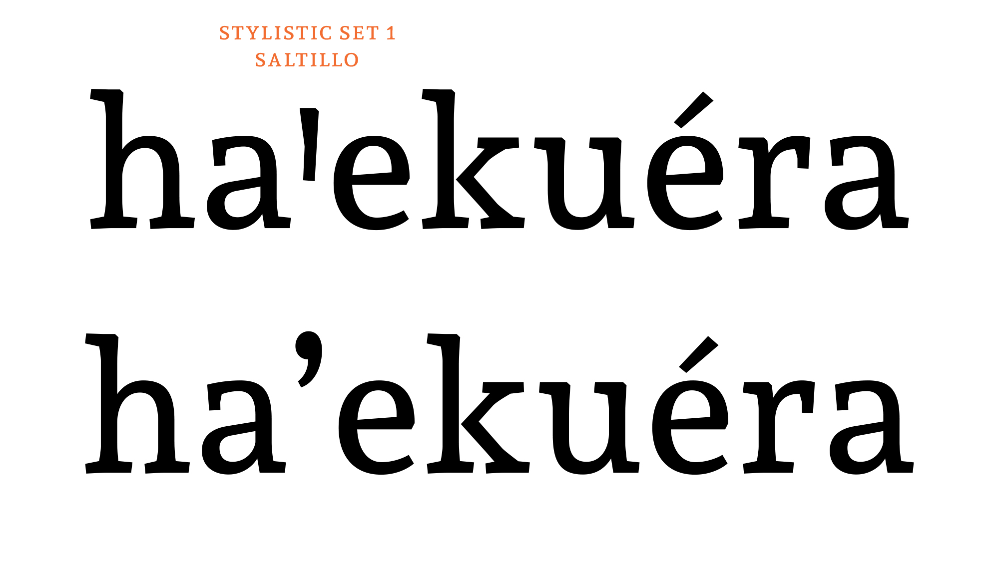
The Guaraní language uses the Latin system, it has a character named puso, which is an identifying sign for Guaraní, like the ñ in Spanish, the č in Czech or the ß in German. The correct sign to represent the puso is the saltillo (Saltillo uniA78B, saltillo uniA78C), but usually it’s replaced by an apostrophe because the saltillo does not appear in the Spanish, English or Portuguese keyboard layouts.
During these 10 years of work I have looked for different solutions to improve the composition of text in Guaraní, from the typographical and technical points of view.
I have developed a new keyboard layout, which allows the Guaraní language users to type naturally in their language.
More info: https://github.com/huertatipografica/teclado-Guarani
Following the original idea of language as design criteria, Andada has improved its performance in different languages:
ss03 replaces the connected cedilla with the disconnected
cedilla.
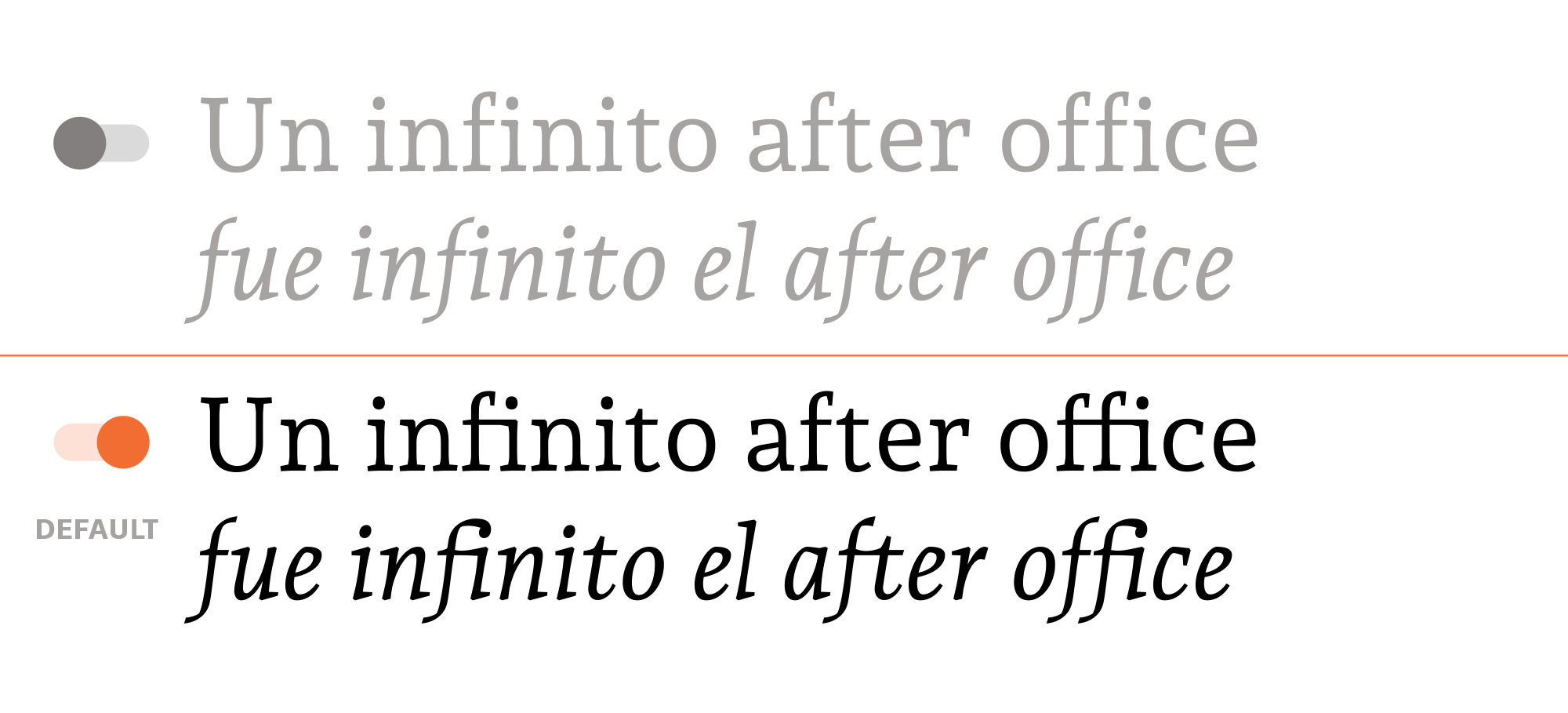
Since 2019 Andada has 4 weights. The Regular is lighter and the bold turns into extra bold, and now there is room for the new family members.
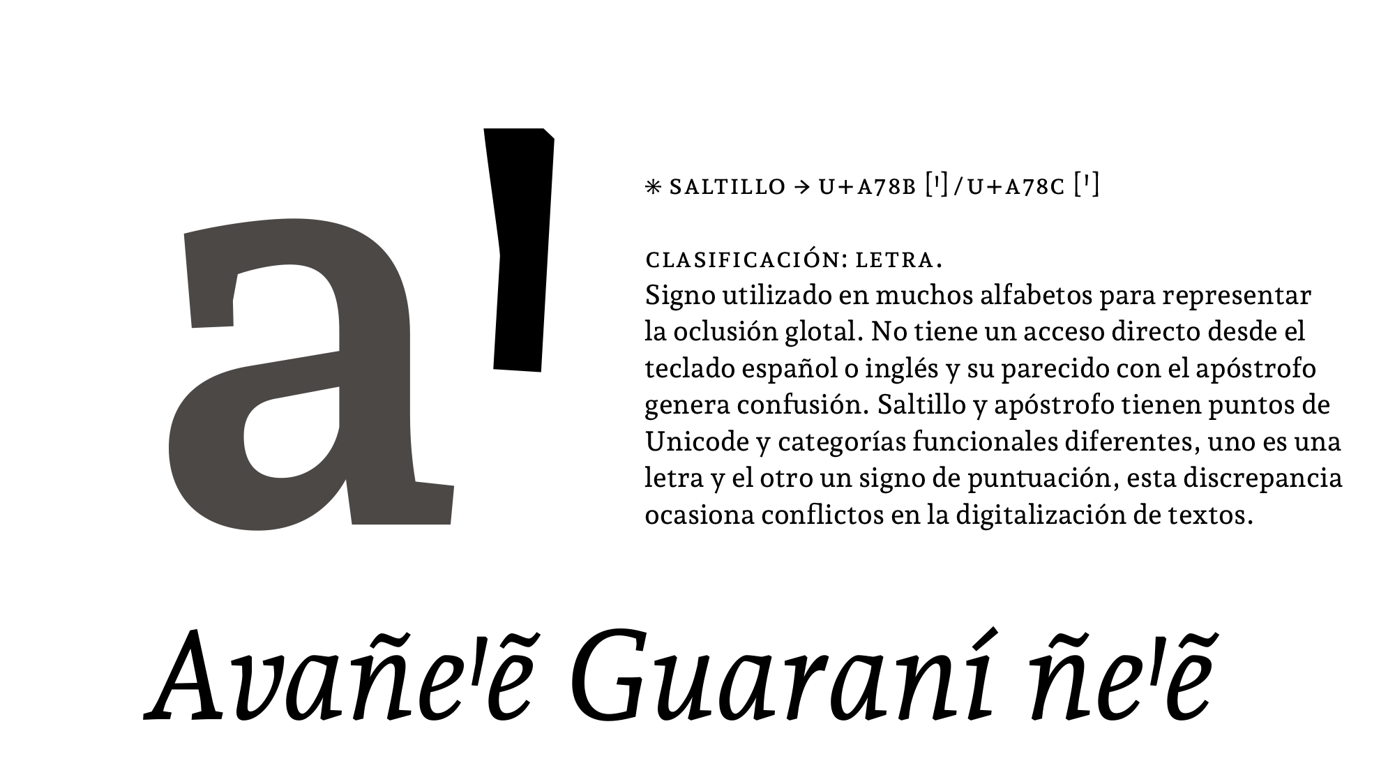
Classification: Letter.
Many alphabets use it to represent glottal occlusion or the glottal stop phoneme. It doesn't have a
shortcut on the Spanish or English keyboard layouts, which is the reason for its resemblance to
the apostrophe, which does have a key. That replacement creates confusion. Saltillo and apostrophe
have different Unicode points and functional categories — one is a letter and the other is a
punctuation mark — and this discrepancy causes conflicts in the digitization of texts.
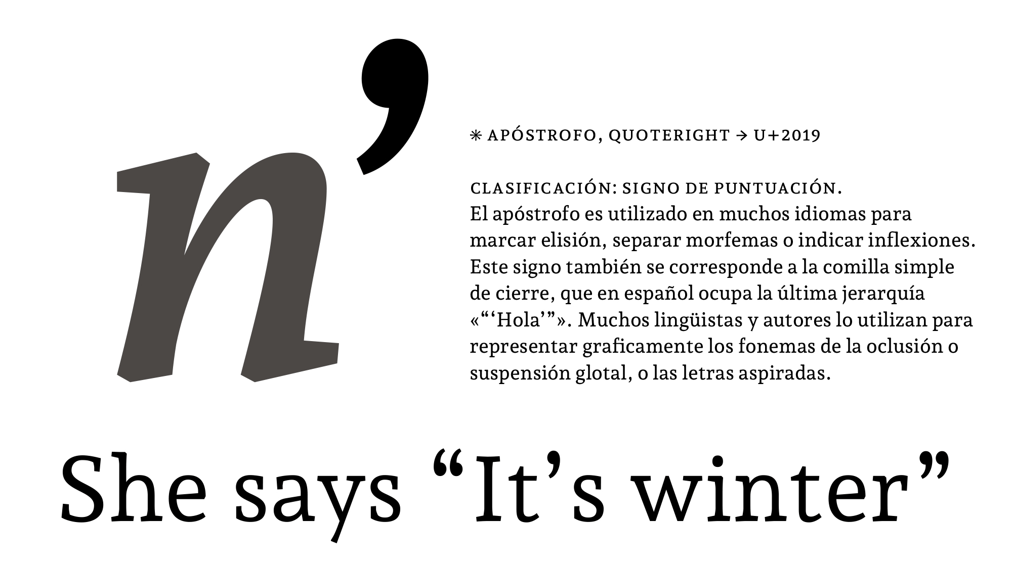
Classification: Punctuation mark.
Many languages use the apostrophe to mark elision, separate morphemes or indicate inflections.
This glyph also coincides with the single quotation mark, which in Spanish occupies the last
hierarchy « “ ‘Hello’ ” ». Many linguists and authors use it to graphically represent the
phonemes of glottal occlusion, suspension or the aspirated letters.
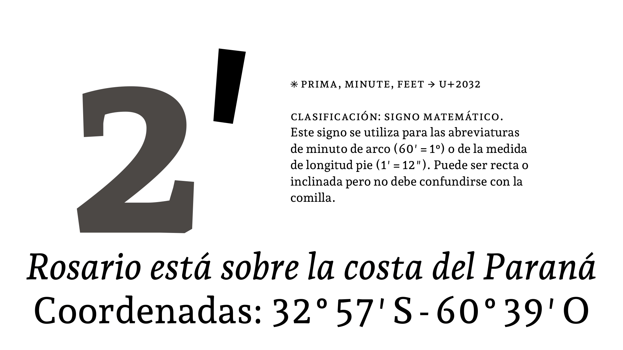
Classification: Mathematical sign.
This sign is used as the abbreviation of minute (60′ = 1º) or the measure of foot length (1 ′ =
12 ″). It can be straight or inclined but it should not be confused with the quotation
mark.
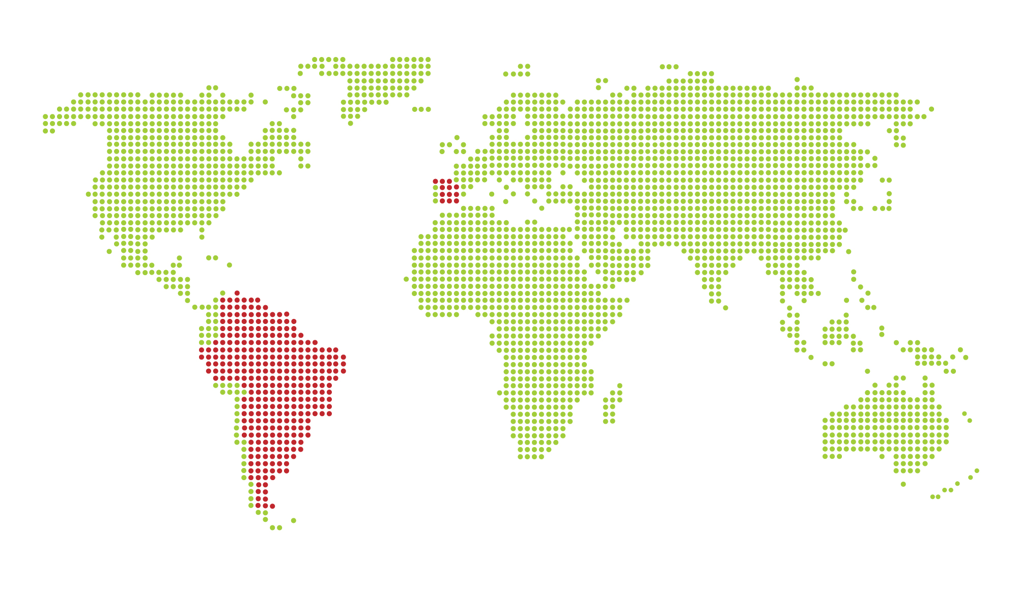
Latin America, Caribbean, Spain and different regions where Guaraní-speaking groups live.
It is an official language in:
It is regulated by the Guaraní Language Academy.
It has approximately 8,000,000 speakers.
Its family language is Tupí.
It uses the Latin system writing.
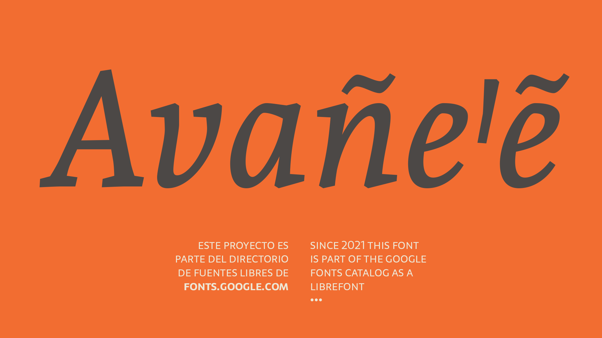
I've developed Andada specifically for the variety known as Paraguayan Guarani (Avañeꞌẽ) that belongs to the Tupi–Guarani family of the Tupian languages.

It's made up of 33 letters, ordered as follows:
A, Ã, Ch, E, Ẽ, G, G̃, H, I, Ĩ, J, K, L, M, Mb, N, Nd, Ng, Nt, Ñ, O, Õ, P, R, Rr, S, T, U, Ũ, V,
Y, Ỹ, Ꞌ.
I've developed Andada specifically for the variety known as Paraguayan Guarani (Avañeꞌẽ) that belongs to the Tupi–Guarani family of the Tupian languages.
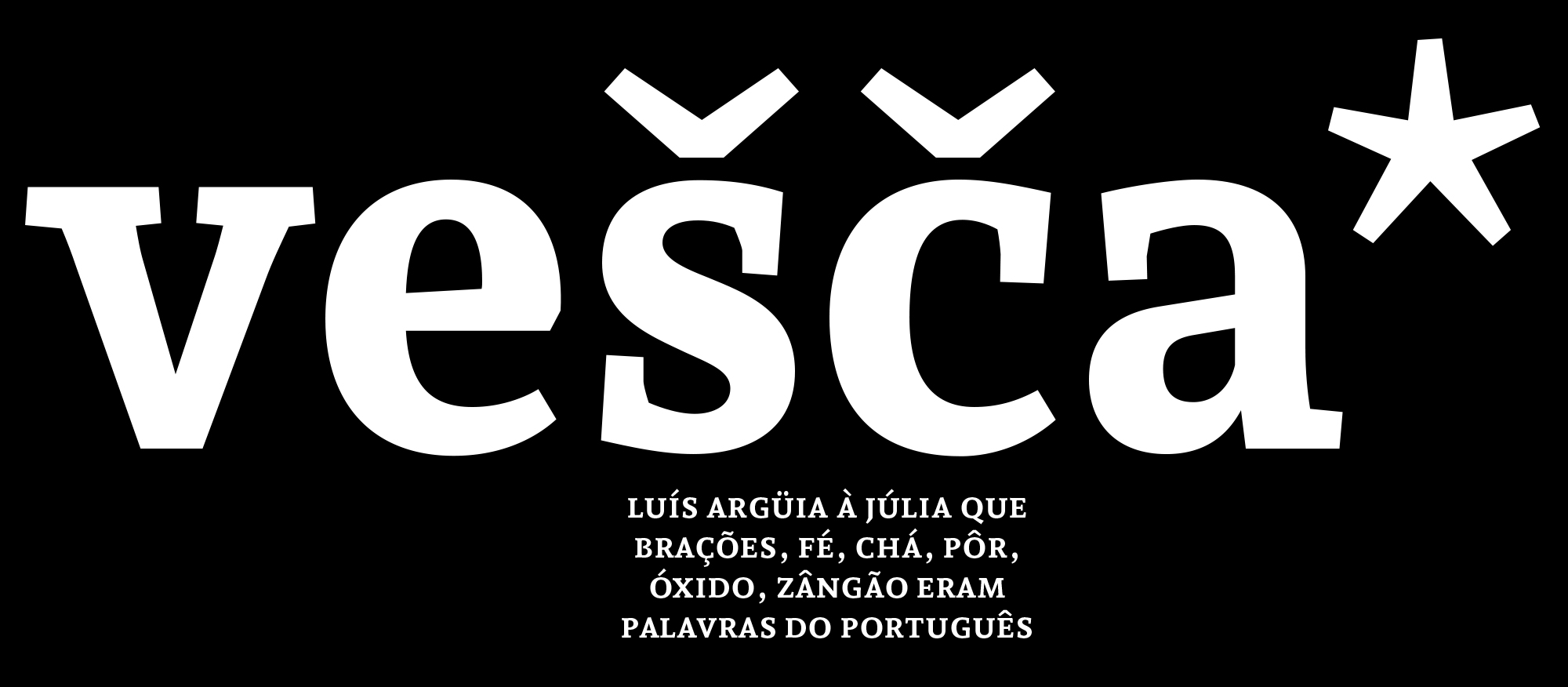
The language validation from Underware validates that Andada pro supports 219 languages
from 212 countries:
Abenaki, Afaan Oromo, Afar, Afrikaans, Albanian, Alsatian, Amis, Anuta, Aragonese,
Aranese, Aromanian, Arrernte, Arvanitic (Latin), Asturian, Atayal, Aymara, Azerbaijani,
Bashkir (Latin), Basque, Belarusian (Latin), Bemba, Bikol, Bislama, Bosnian, Breton,
Cape Verdean Creole, Catalan, Cebuano, Chamorro, Chavacano, Chichewa, Chickasaw,
Cimbrian, Cofán, Cornish, Corsican, Creek, Crimean Tatar (Latin), Croatian, Czech,
Danish, Dawan, Delaware, Dholuo, Drehu, Dutch, English, Esperanto, Estonian, Faroese,
Fijian, Filipino, Finnish, Folkspraak, French, Frisian, Friulian, Gagauz (Latin),
Galician, Ganda, Genoese, German, Gikuyu, Gooniyandi, Greenlandic (Kalaallisut),
Guadeloupean Creole, Gwich’in, Haitian Creole, Hän, Hawaiian, Hiligaynon, Hopi, Hotcąk
(Latin), Hungarian, Icelandic, Ido, Igbo, Ilocano, Indonesian, Interglossa, Interlingua,
Irish, Istro-Romanian, Italian, Jamaican, Javanese (Latin), Jèrriais, Kaingang, Kala
Lagaw Ya, Kapampangan (Latin), Kaqchikel, Karakalpak (Latin), Karelian (Latin),
Kashubian, Kikongo, Kinyarwanda, Kiribati, Kirundi, Klingon, Kurdish (Latin), Ladin,
Latin, Latino sine Flexione, Latvian, Lithuanian, Lojban, Lombard, Low Saxon,
Luxembourgish, Maasai, Makhuwa, Malay, Maltese, Manx, Māori, Marquesan,
Megleno-Romanian, Meriam Mir, Mirandese, Mohawk, Moldovan, Montagnais, Montenegrin,
Murrinh-Patha, Nagamese Creole, Nahuatl, Ndebele, Neapolitan, Ngiyambaa, Niuean,
Noongar, Norwegian, Novial, Occidental, Occitan, Old Icelandic, Old Norse, Onĕipŏt,
Oshiwambo, Ossetian (Latin), Palauan, Papiamento, Piedmontese, Polish, Portuguese,
Potawatomi, Q’eqchi’, Quechua, Rarotongan, Romanian, Romansh, Rotokas, Sami (Inari
Sami), Sami (Lule Sami), Sami (Northern Sami), Sami (Southern Sami), Samoan, Sango,
Saramaccan, Sardinian, Scottish Gaelic, Serbian (Latin), Seri, Seychellois Creole,
Shawnee, Shona, Sicilian, Silesian, Slovak, Slovenian, Slovio (Latin), Somali, Sorbian
(Lower Sorbian), Sorbian (Upper Sorbian), Sotho (Northern), Sotho (Southern), Spanish,
Sranan, Sundanese (Latin), Swahili, Swazi, Swedish, Tagalog, Tahitian, Tetum, Tok Pisin,
Tokelauan, Tongan, Tshiluba, Tsonga, Tswana, Tumbuka, Turkish, Turkmen (Latin), Tuvaluan,
Tzotzil, Uzbek (Latin), Venetian, Vepsian, Volapük, Võro, Wallisian, Walloon,
Waray-Waray, Warlpiri, Wayuu, Welsh, Wik-Mungkan, Wiradjuri, Wolof, Xavante, Xhosa,
Yapese, Yindjibarndi, Zapotec, Zarma, Zazaki, Zulu & Zuni.
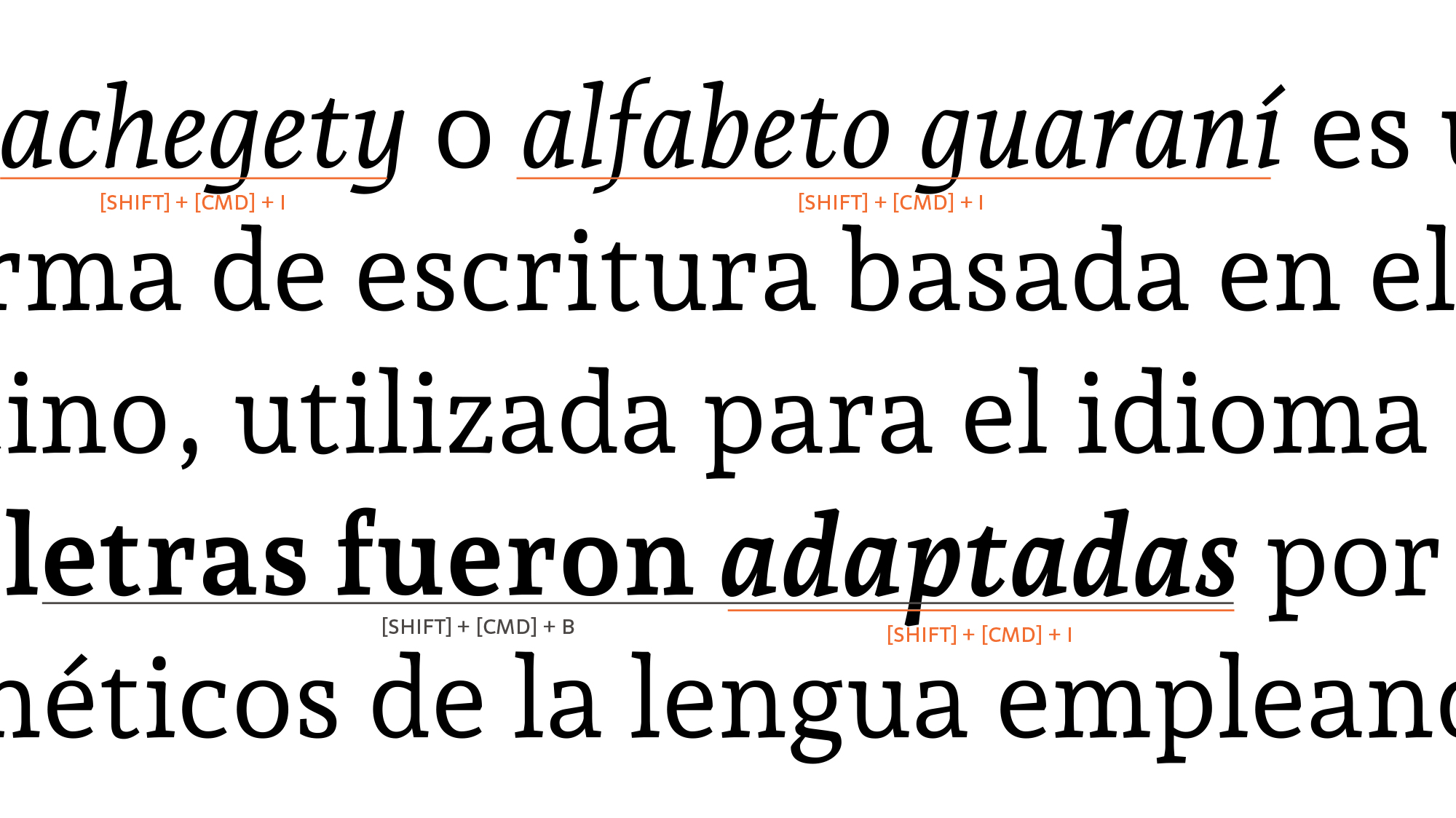
[liga]Historically, these ligatures were designed to improve the kerning and readability of certain letter pairs that, due to their design or structure, make the setting difficult. Here, this tradition continues as an aesthetic resource. This feature should be active by default. Below are the standard and historical ligatures.
[dlig]They are designed to be ornamental, and not specifically designed for readability. This feature should be off by default.
[calt]This feature should be active by default. It is designed to enhance readability by providing better joining behavior between the characters that make up the ligature.
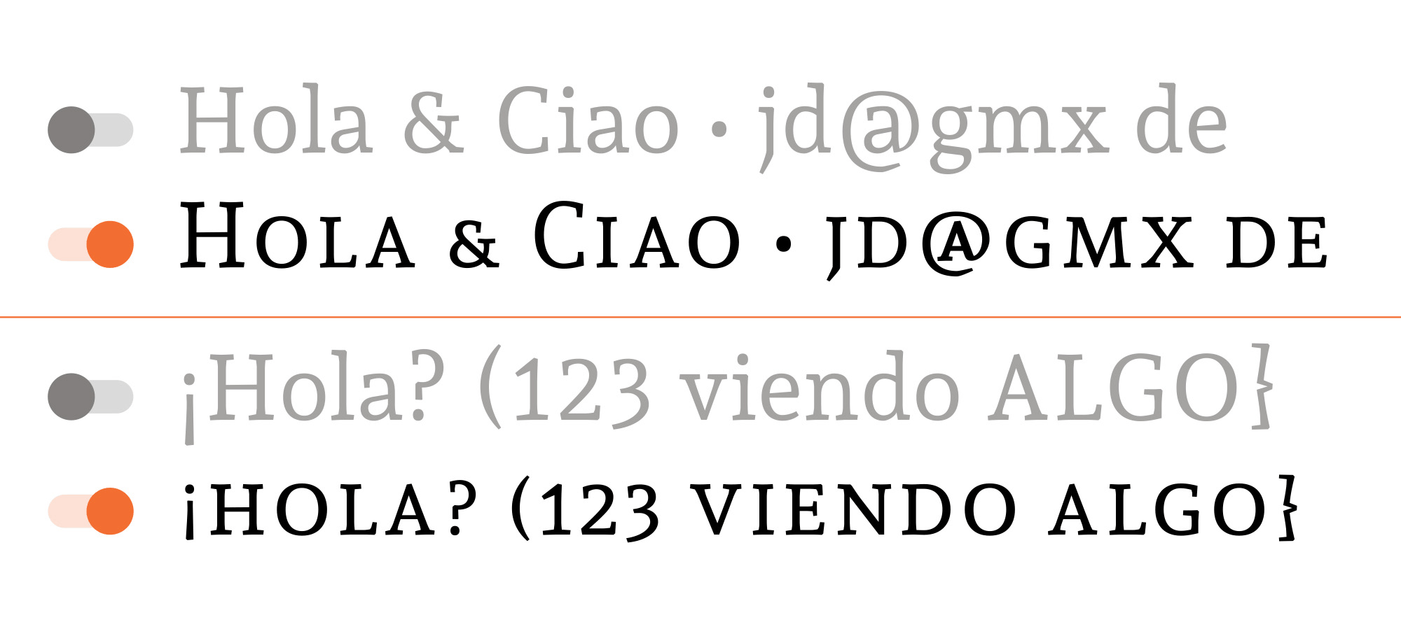
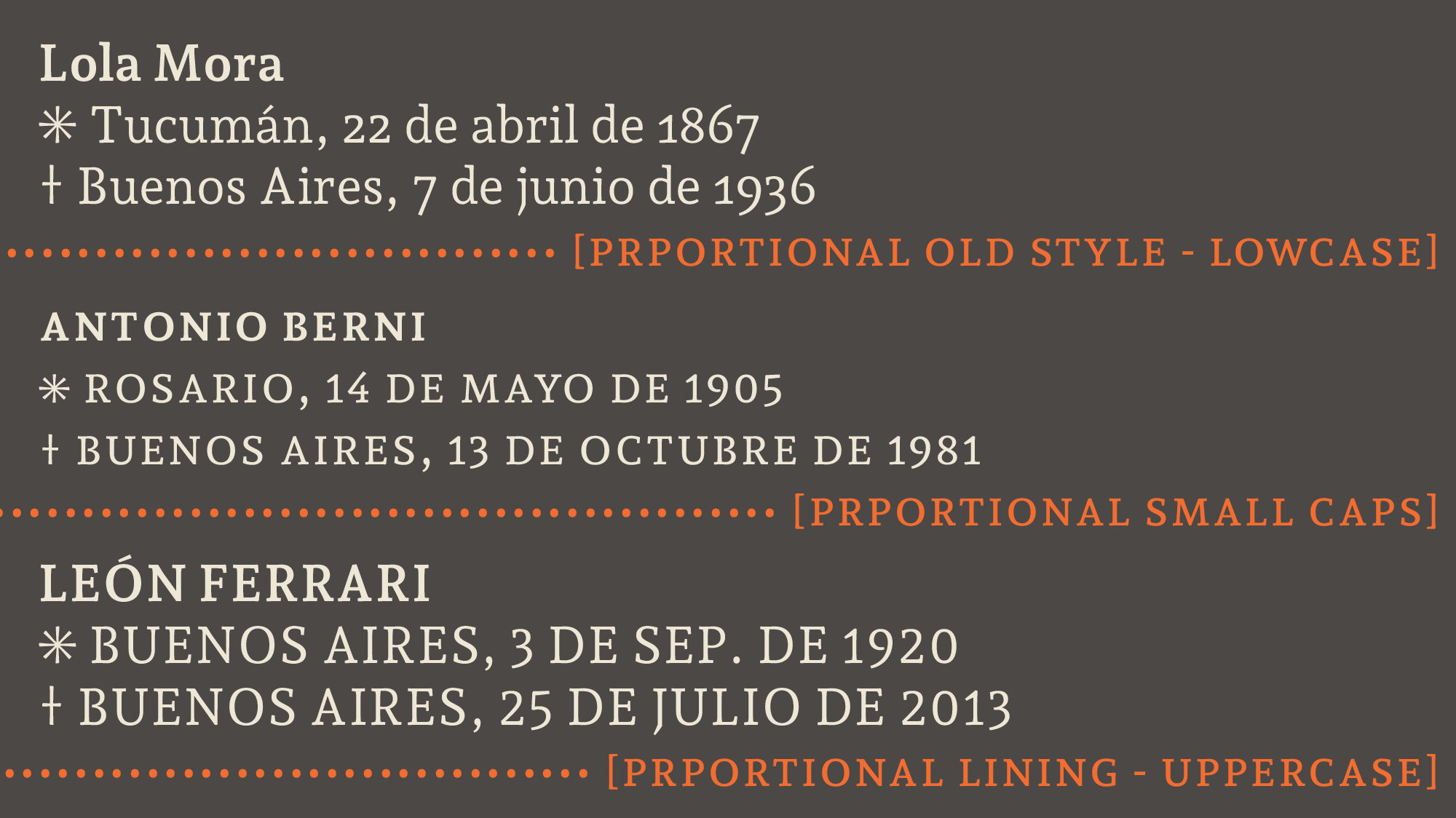
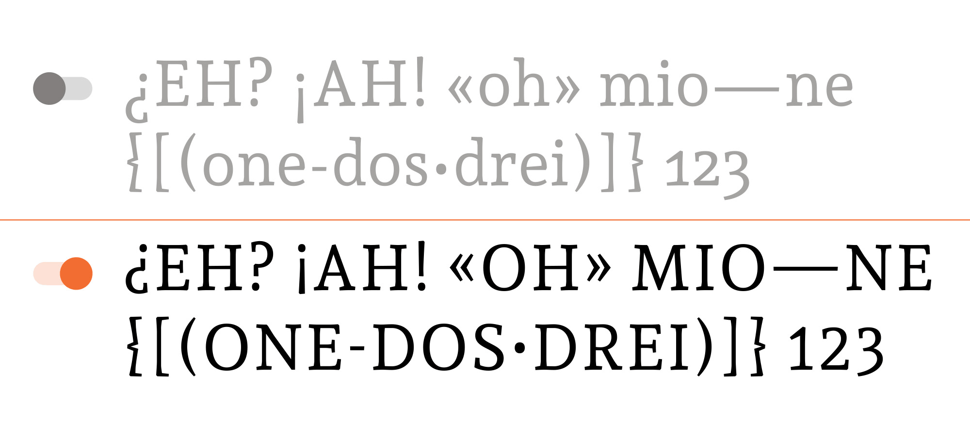
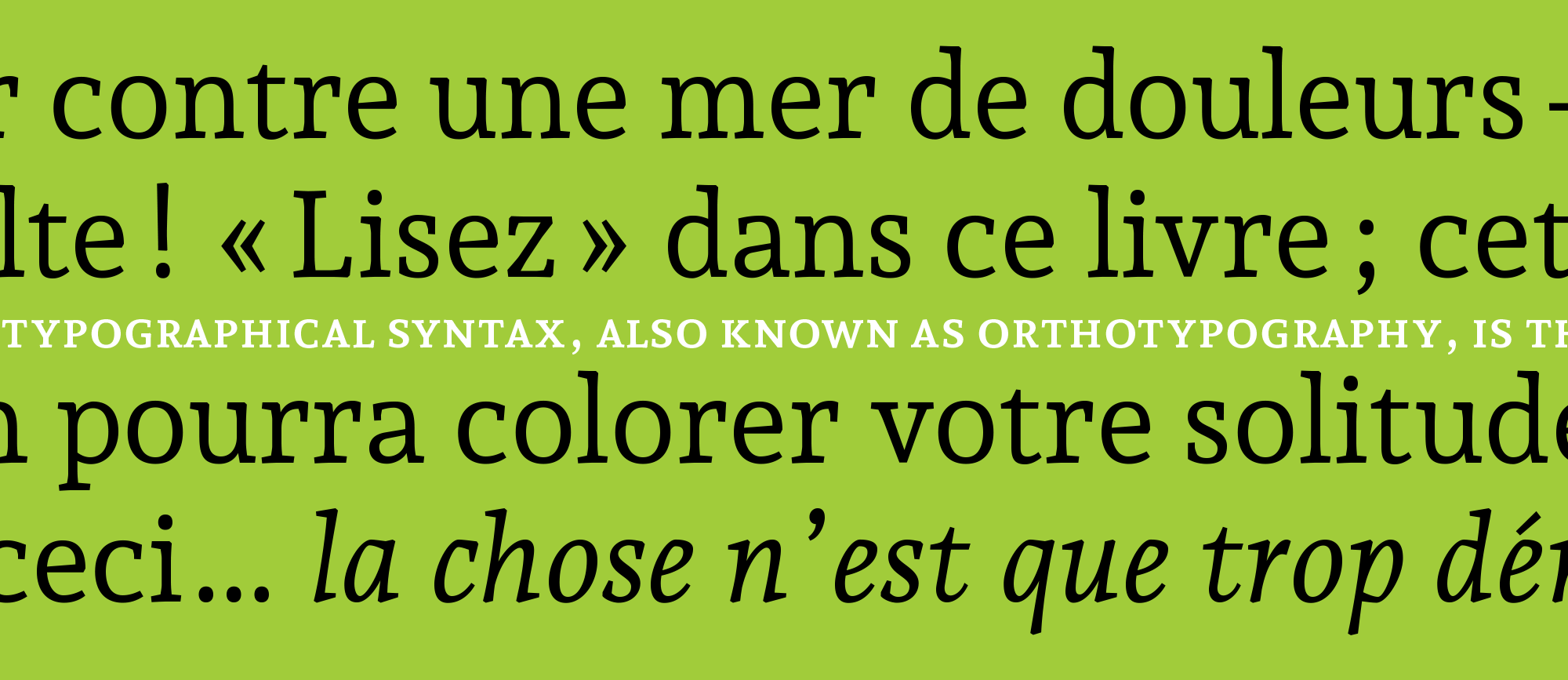
[smcp][c2sc]We have two small caps options:
The orthotypographic rules or “conventions” for the use of small caps are not strict, nowadays
their function is more aesthetic than communicational.
[More info: Orthotypography]
[case]By default, glyphs in a text typeface are designed to work with lowercase characters; sometimes
you may need to set your text in all caps, where figures, parentheses, guillemets, dashes,
hyphens and other punctuation marks don’t match with lowercase. When the “all caps feature” (not
when text is typed in caps) is enabled, case-sensitive forms are automatically applied. The
coexistence of uppercase, non-alphabetic signs, numbers, punctuation, etc., requires a review
of space, proportion and position. This feature is developed to enhance the word's and
paragraph's rhythm.
It's active by default when the text has the “All Caps” option enabled.
The typographic categories affected are: letters, punctuation, figures and symbols.
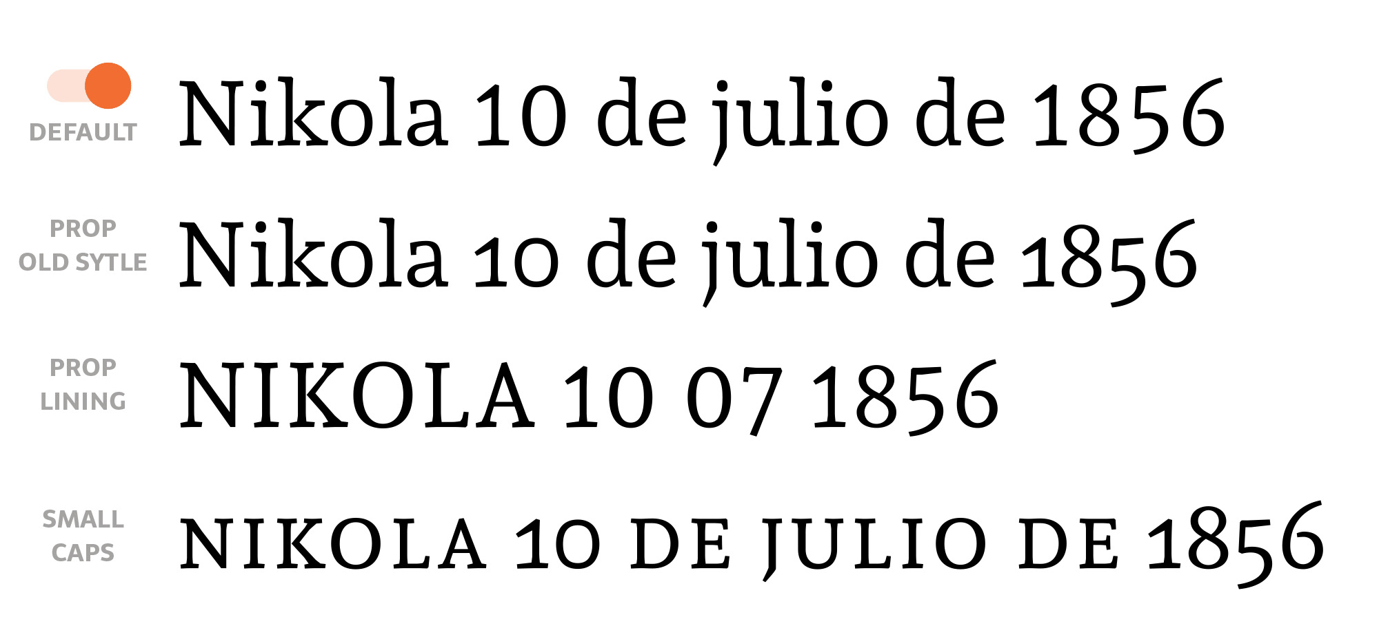
Each figure (number) set is designed for a particular design situation. Therefore each set has
its own space, proportion and structure to live together with its own type-partners.
Lining
or uppercase figures are designed to harmonize with uppercase, while old style, lowercase or
Elzevir figures are designed to live together with lowercase; they have ascender, descender
and lowercase proportions.
The lining figures in Andada are not strictly lining — they are “hybrid figures” and they are
the default set. They have shorter ascender and descender and a proportion between uppercase
and lowercase.
[More info: Orthotypography]
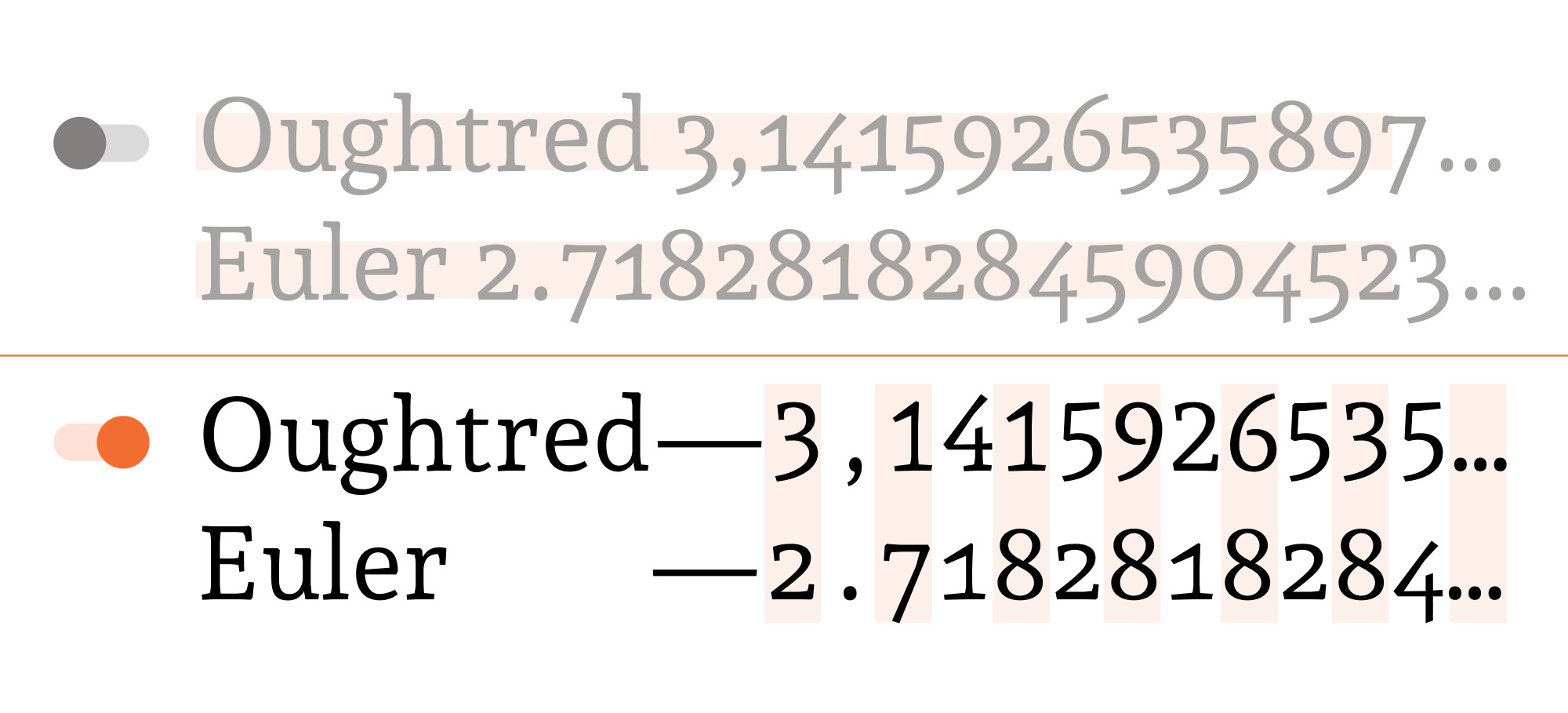
The tabular figures’ priority is vertical readability, while the proportional figures’ priority
is horizontal readability.
The tabular figures have a fixed width in all weights and variants. They can build a column in
tables and lists.
The proportional figures have varying widths to harmonize with the horizontal text context.
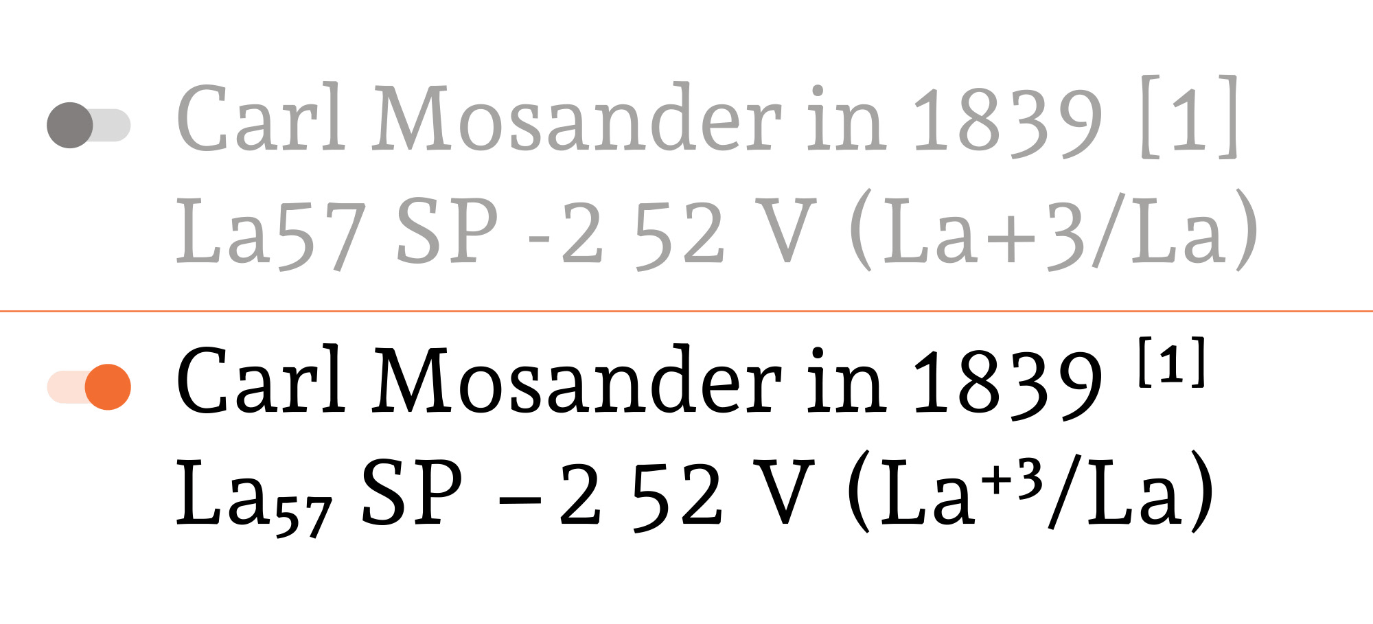
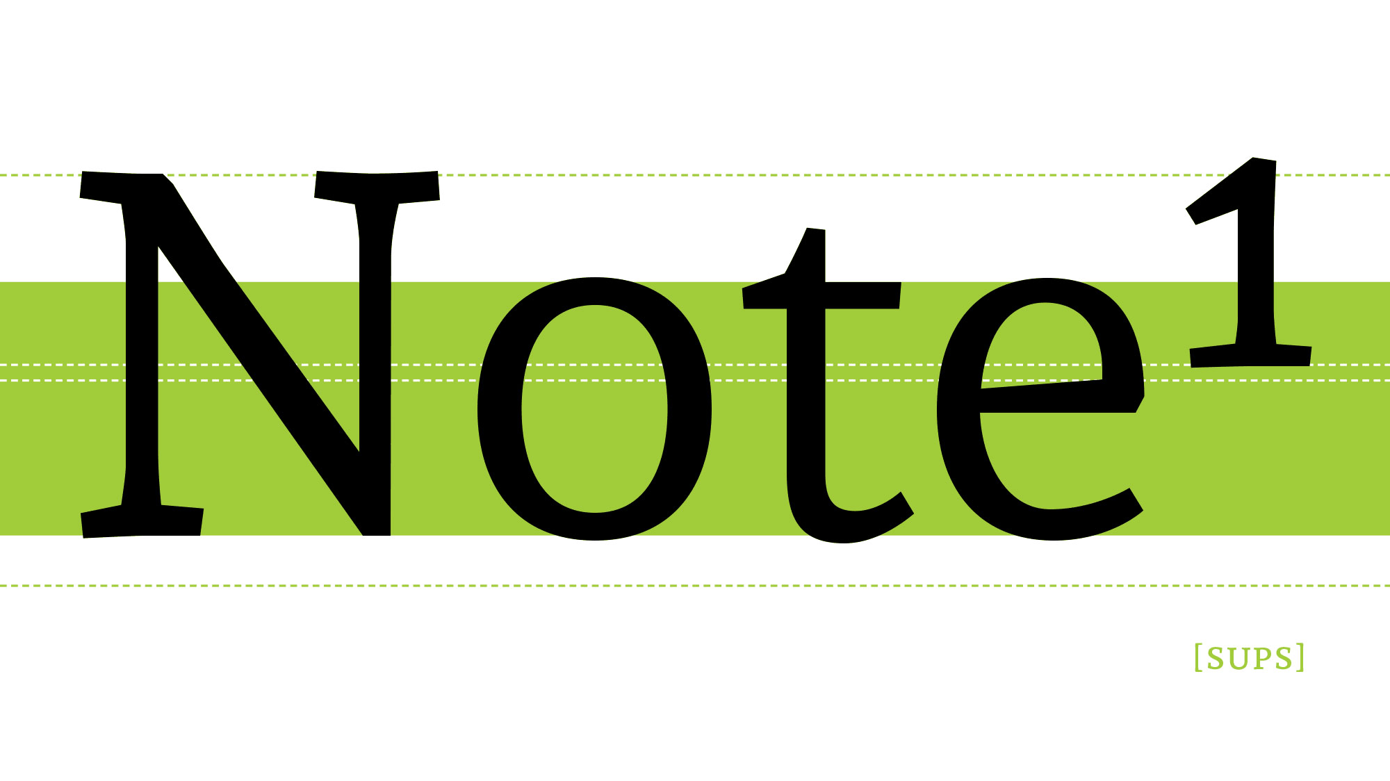
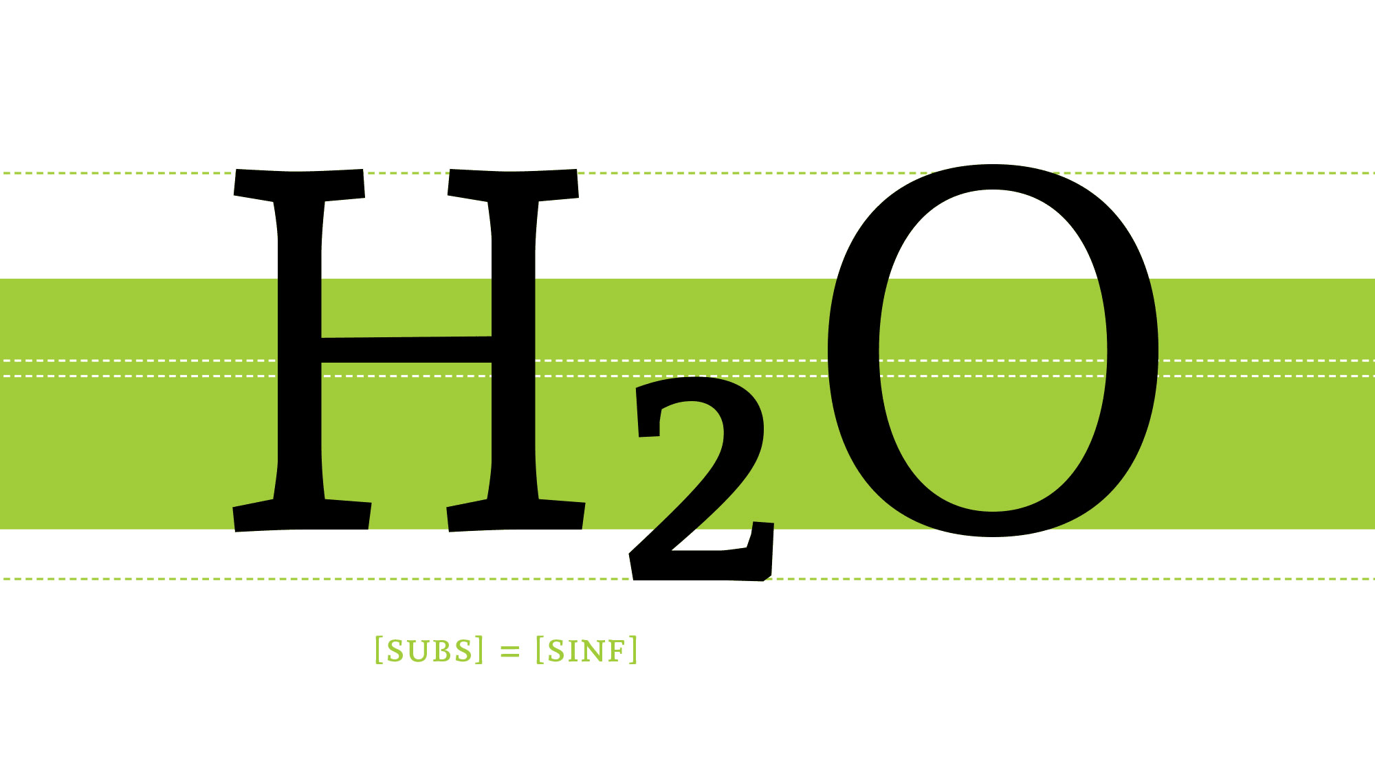
[sups] ↑ [subs] = Scientific Inferiors [sinf] ↓This feature replaces all figures with their superior/inferior alternates. These can be used for
footnotes, mathematical, chemical or scientific notation.
The superscript set affects figures, lowercase letters, some punctuation and some
symbols.
Subscript and scientific inferior are the same set.
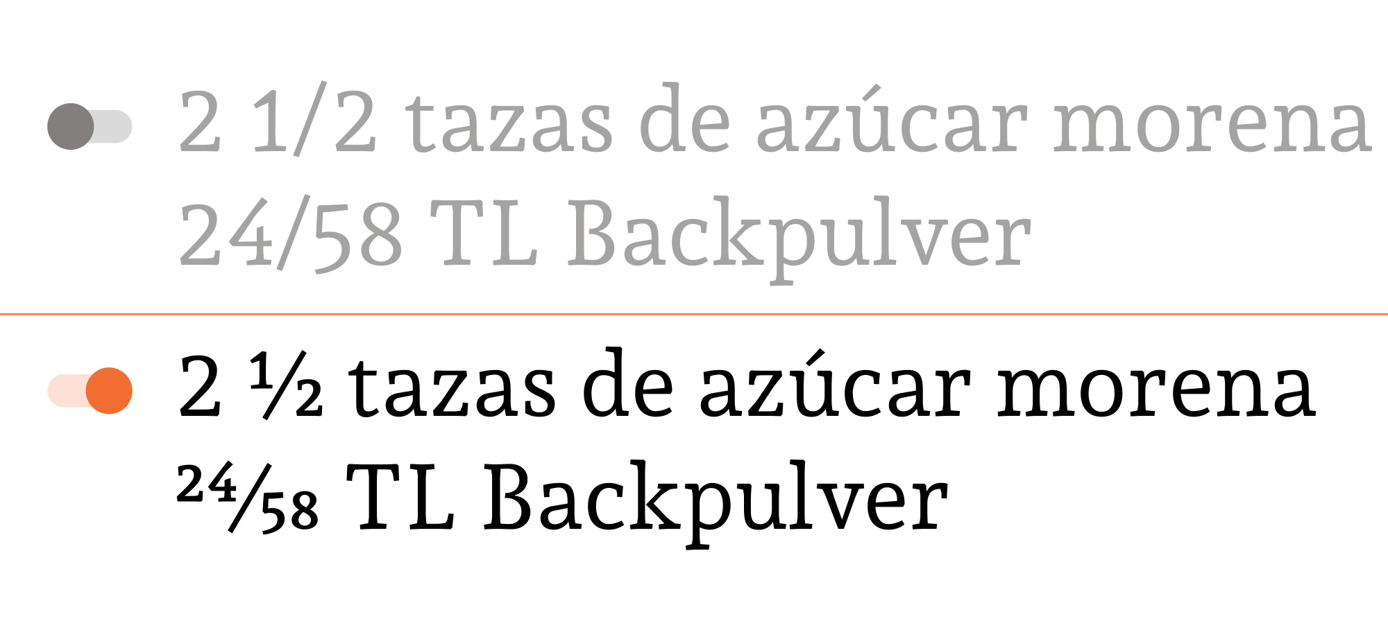
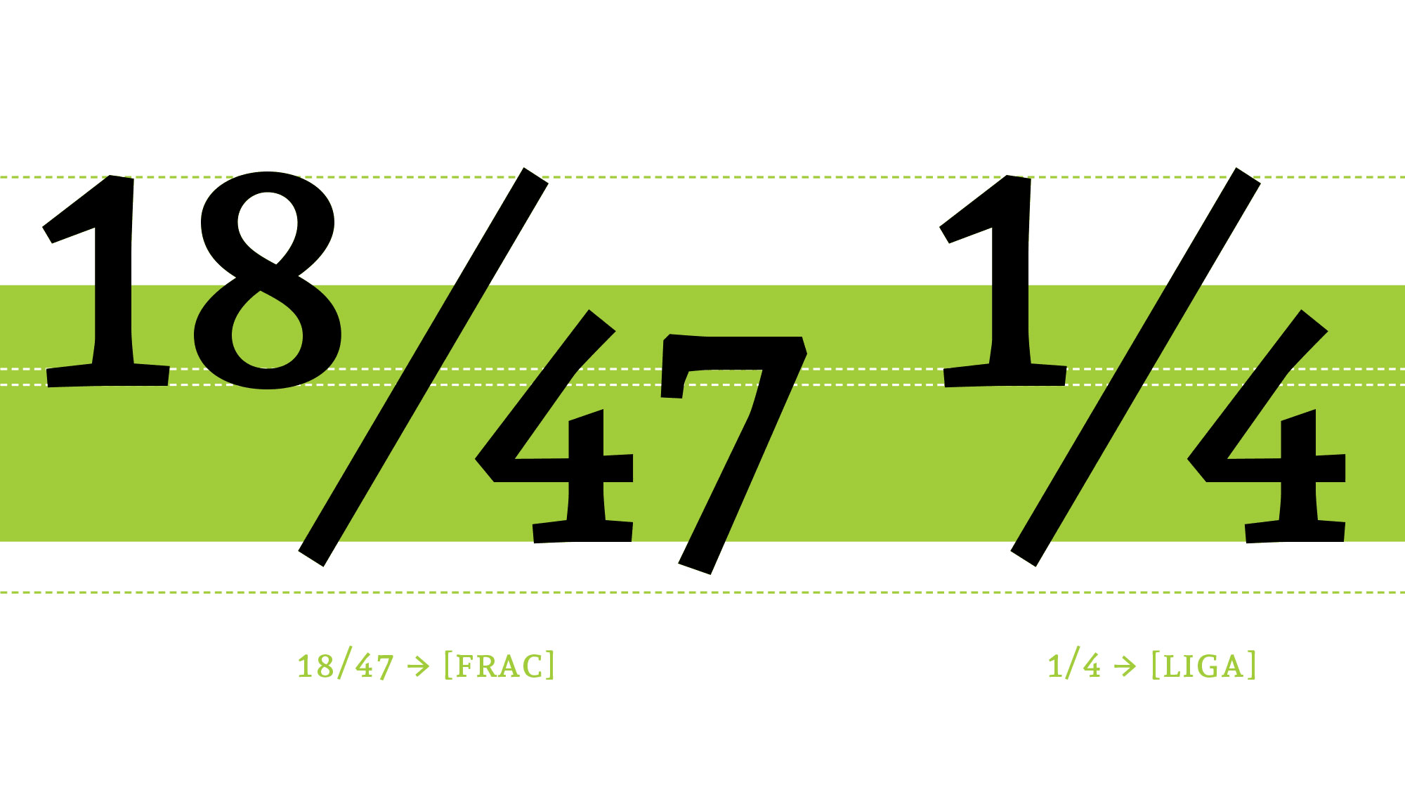
[frac][numr] ↑[dnom] ↓ Numerators and denominators are aligned to build diagonal fractions.
The font includes a basic set —¼ ½ ¾ ⅓ ⅔ ⅛ ⅜ ⅝ ⅞— which is enabled by default with the OpenType
ligatures.
If the fraction feature is enabled, you can build any fraction quickly by typing the
sequence: [number] [slash] [number]. The numbers before the slash are replaced by numerators,
the numbers after the slash are replaced by denominators, and the slash glyph is replaced by
the bar.
This feature can differentiate between fractions and dates.
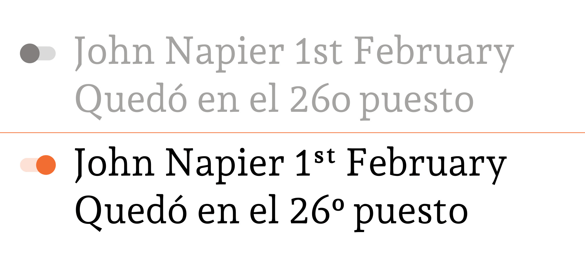
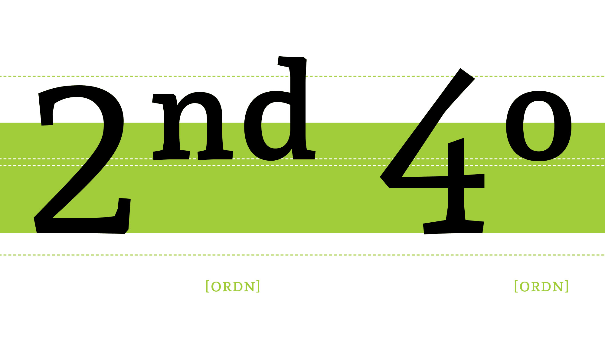
[ordn]This feature replaces default alphabetic glyphs with the corresponding ordinal forms and transforms them into an ordinal expression.
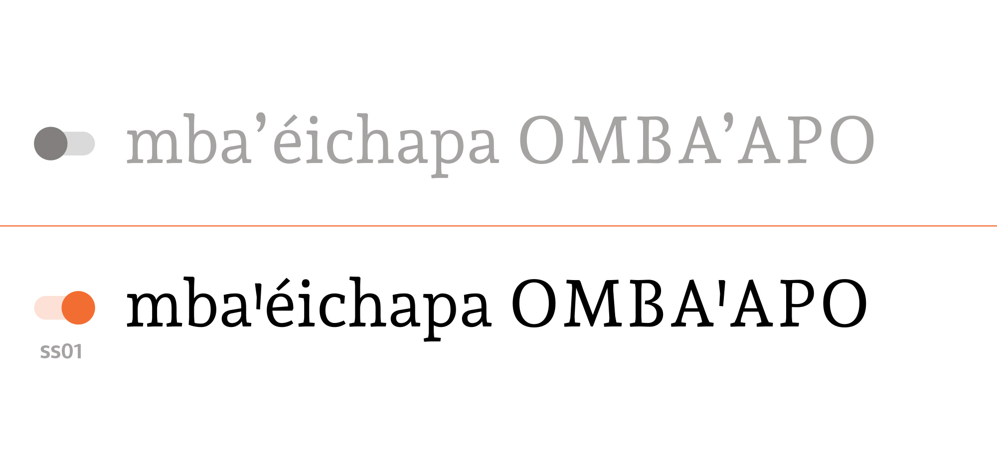
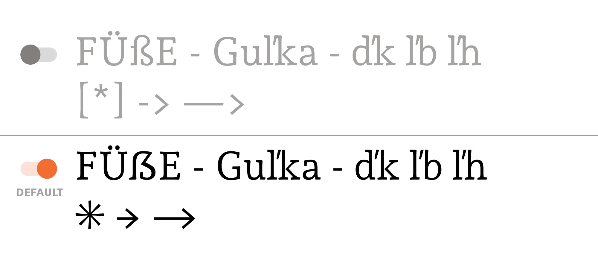
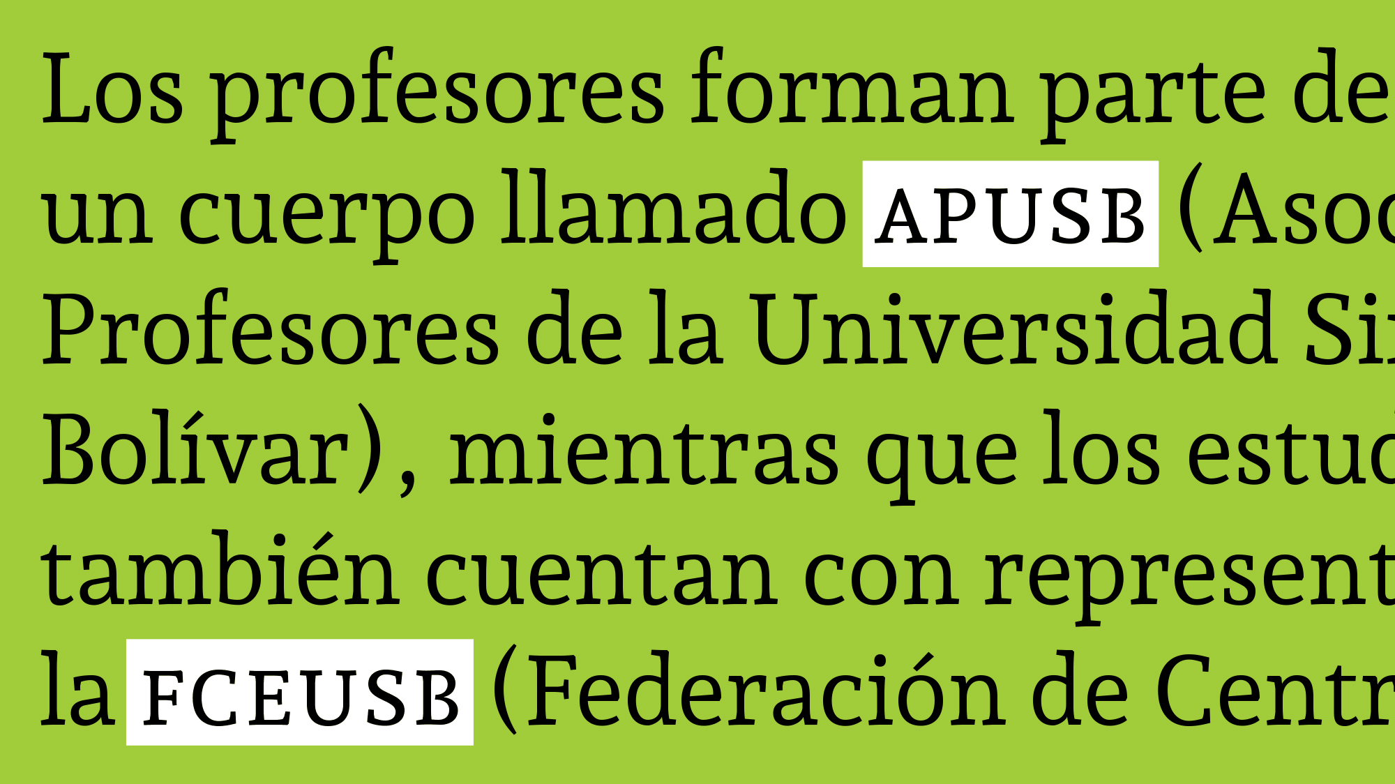
[ss01] - GUARANIThis feature replaces default apostrophe or quotesingle glyphs (U+0027 or U+2019) with the corresponding saltillo glyph (U+A78B - U+A78C, lower- and uppercase). It only happens when the apostrophe or quotesingle is between vowels.
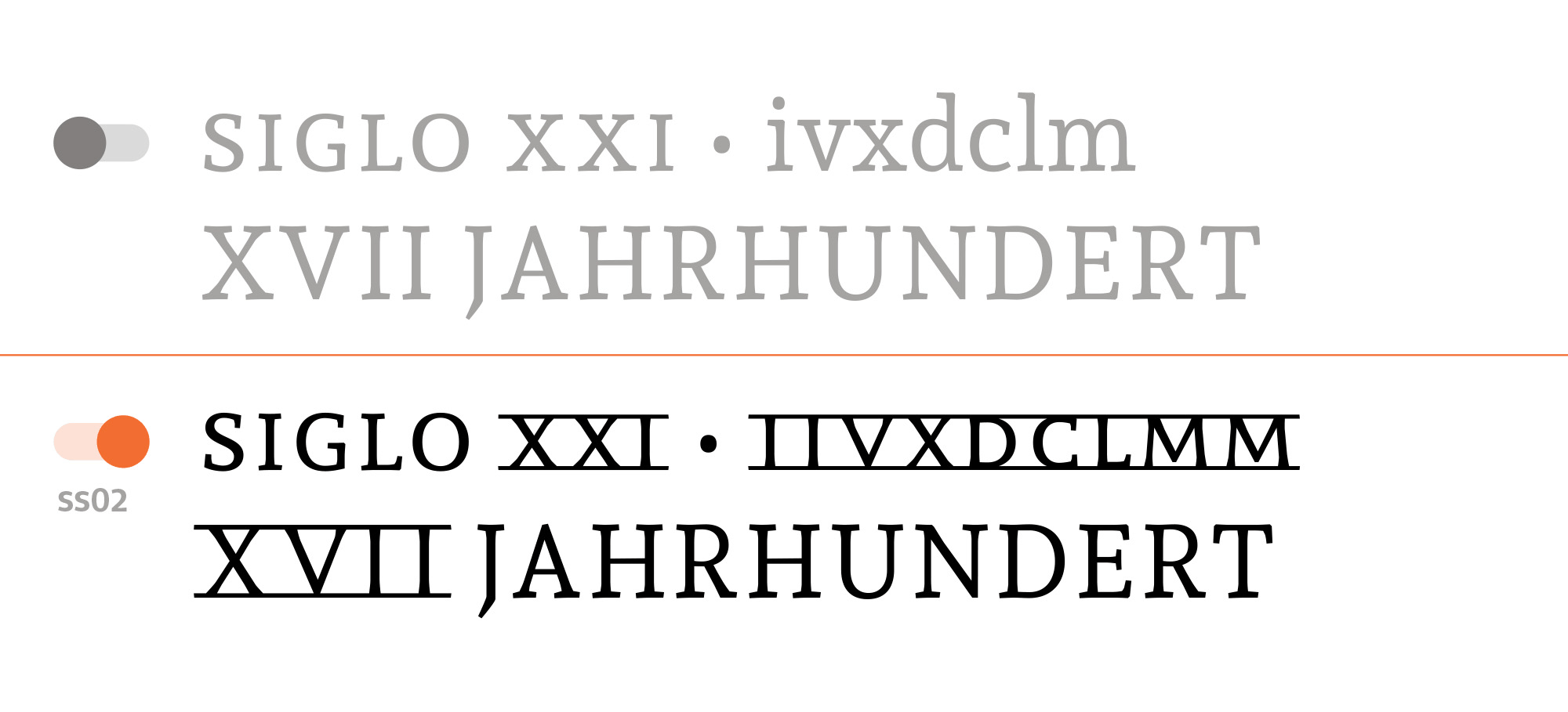
[ss02] - Roman NumeralsThis feature replaces i v x d c l m glyphs with the corresponding glyph forms from the Roman numerals.
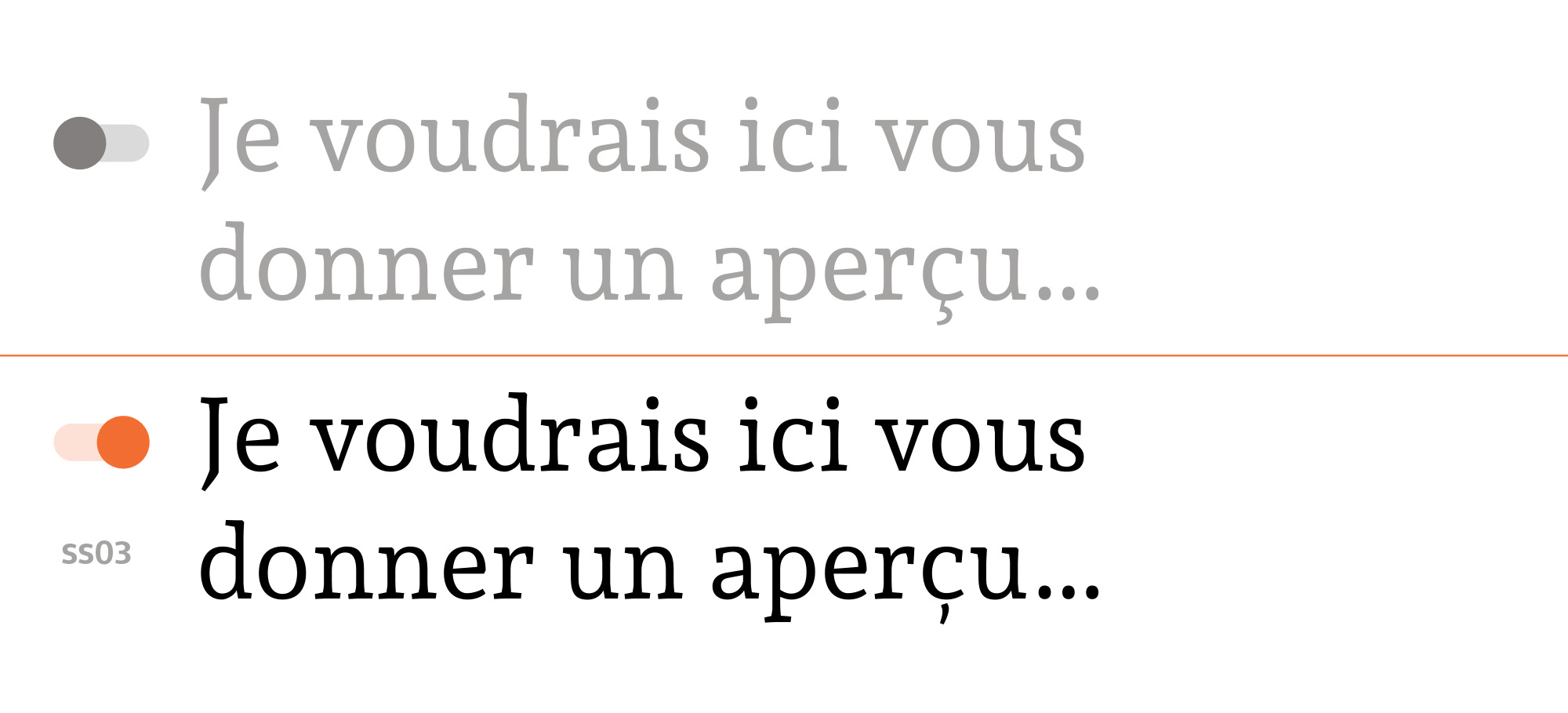
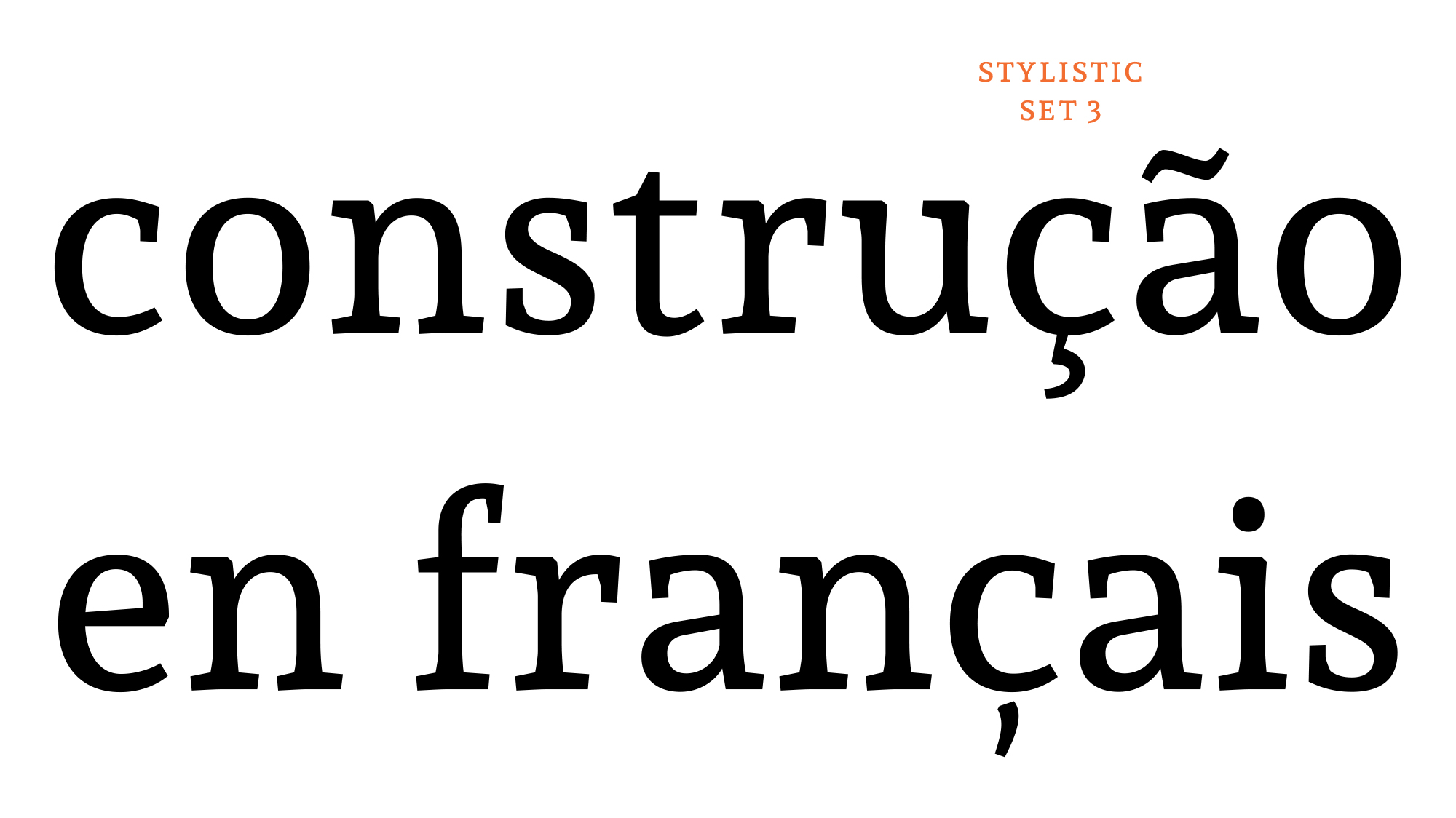
[ss03]Andada has two designs for cedilla, connected and unconnected.
This feature replaces default cedilla connected glyph with the corresponding unconnected
form.
The default cedilla form is the connected one.
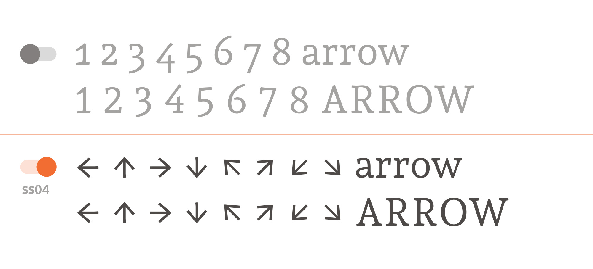
[ss04] - ArrowsThis feature replaces 1-0 glyphs with arrow glyph forms.
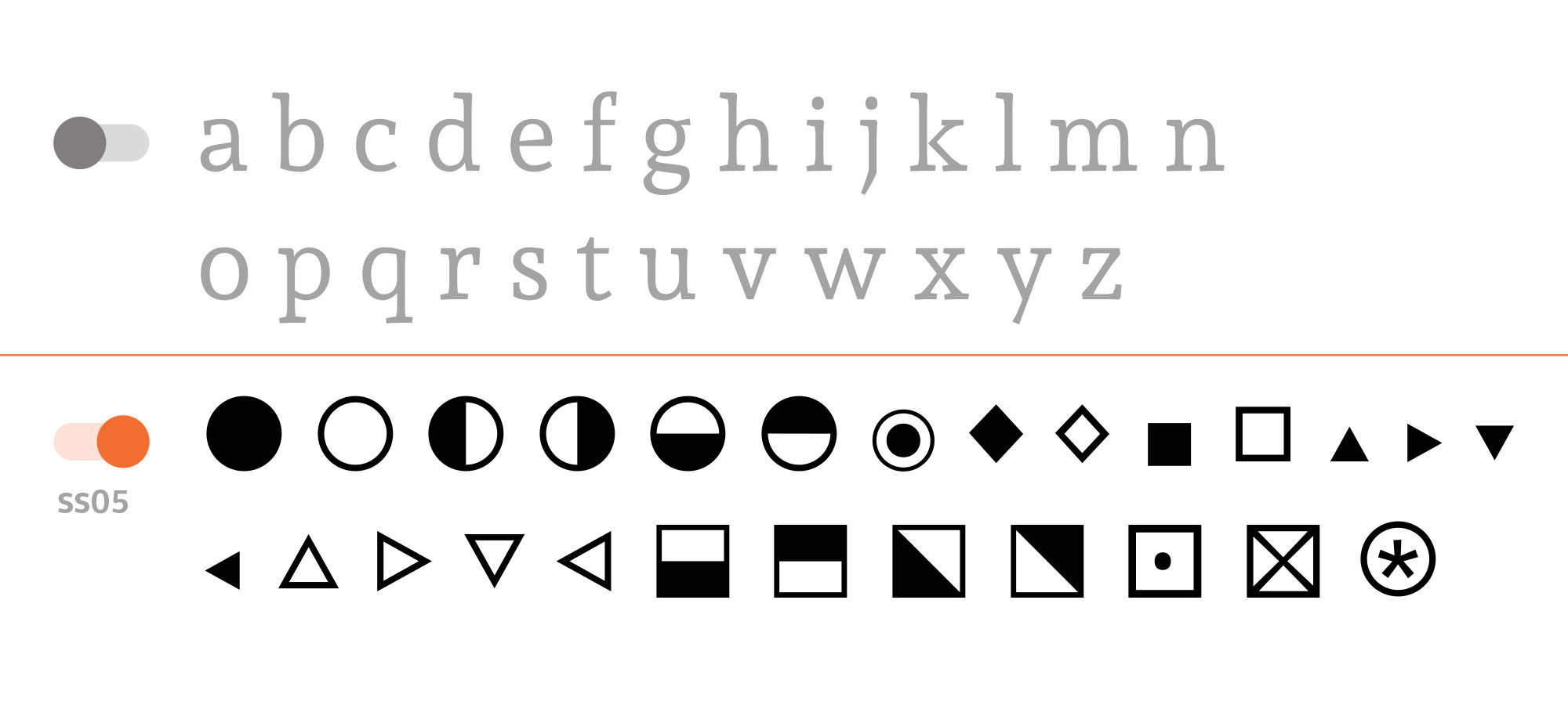
[ss05] - GeometryThis feature replaces a-z glyphs with geometric glyph forms.
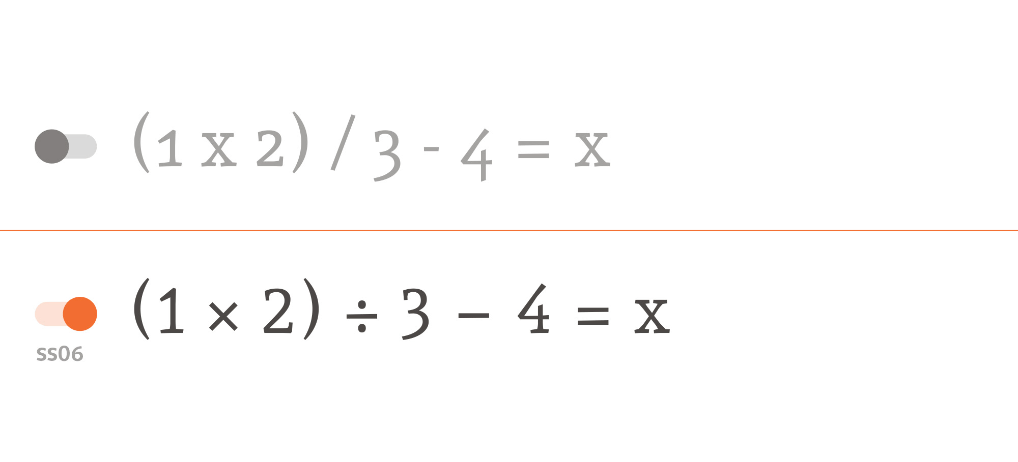
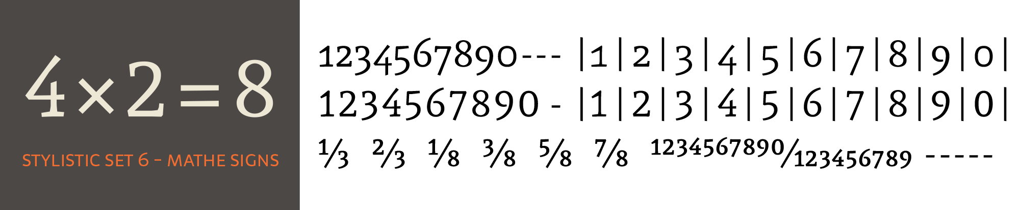
[ss06] - Mathematical signsThis feature replaces [x] [hyphen] and [slash] glyphs with the corresponding mathematical glyph forms [multiply] [minus] and [divide].
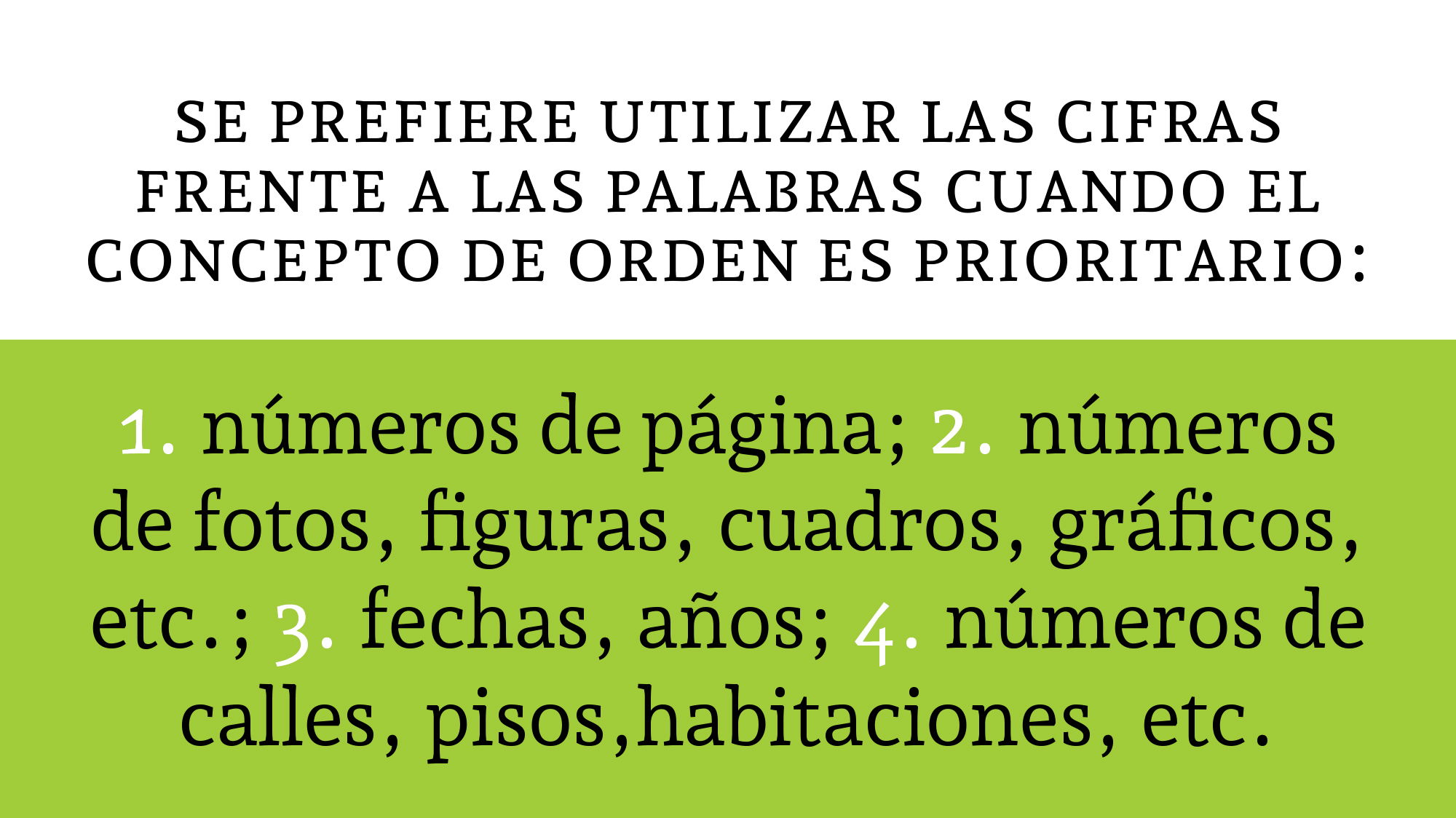
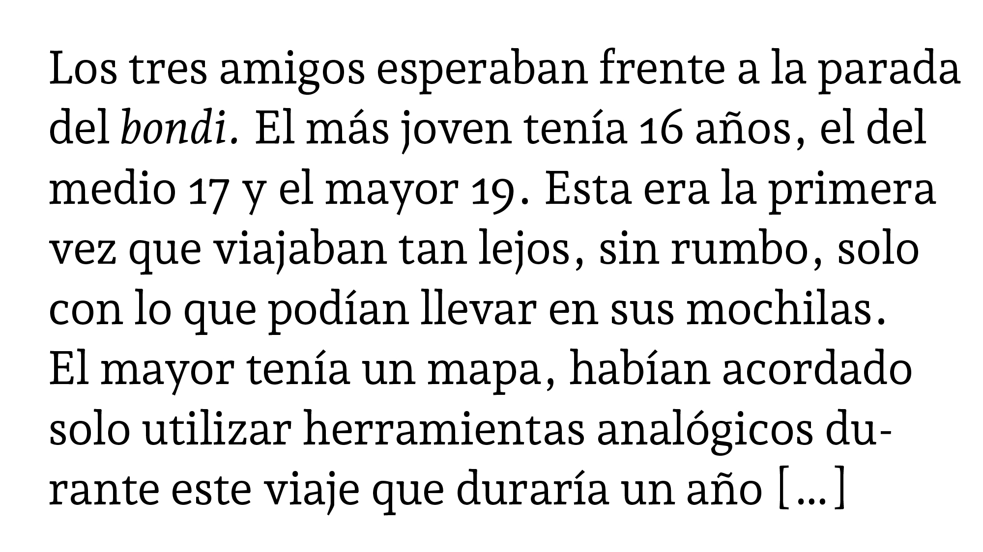
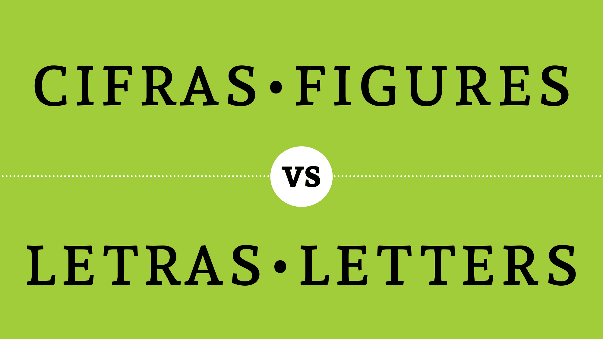
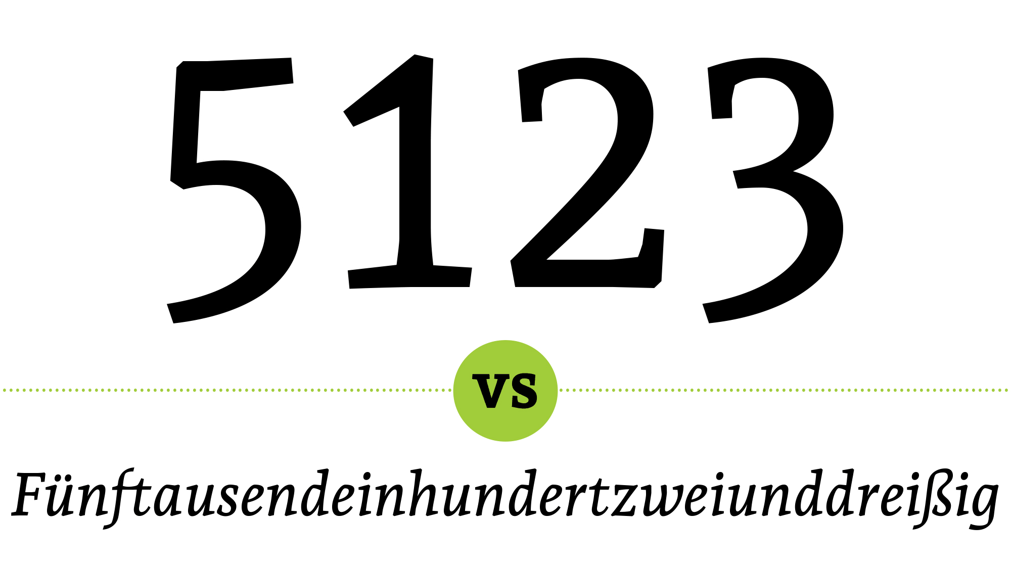
A number could be written in figures (numbers: 1 2 3…) or in letters (words: one, two, three…).
The figures have the same hierarchy as the words and both have to observe the same orthographic
and orthotypographic rules, except for hyphenation.
Figures belong to the figures system and
letters belong to the letter system. When a text has letters and figures, both systems have to
be reconciled.
The content and the meaning of the text are what determine whether you should use figures or letters.
Usage tips:
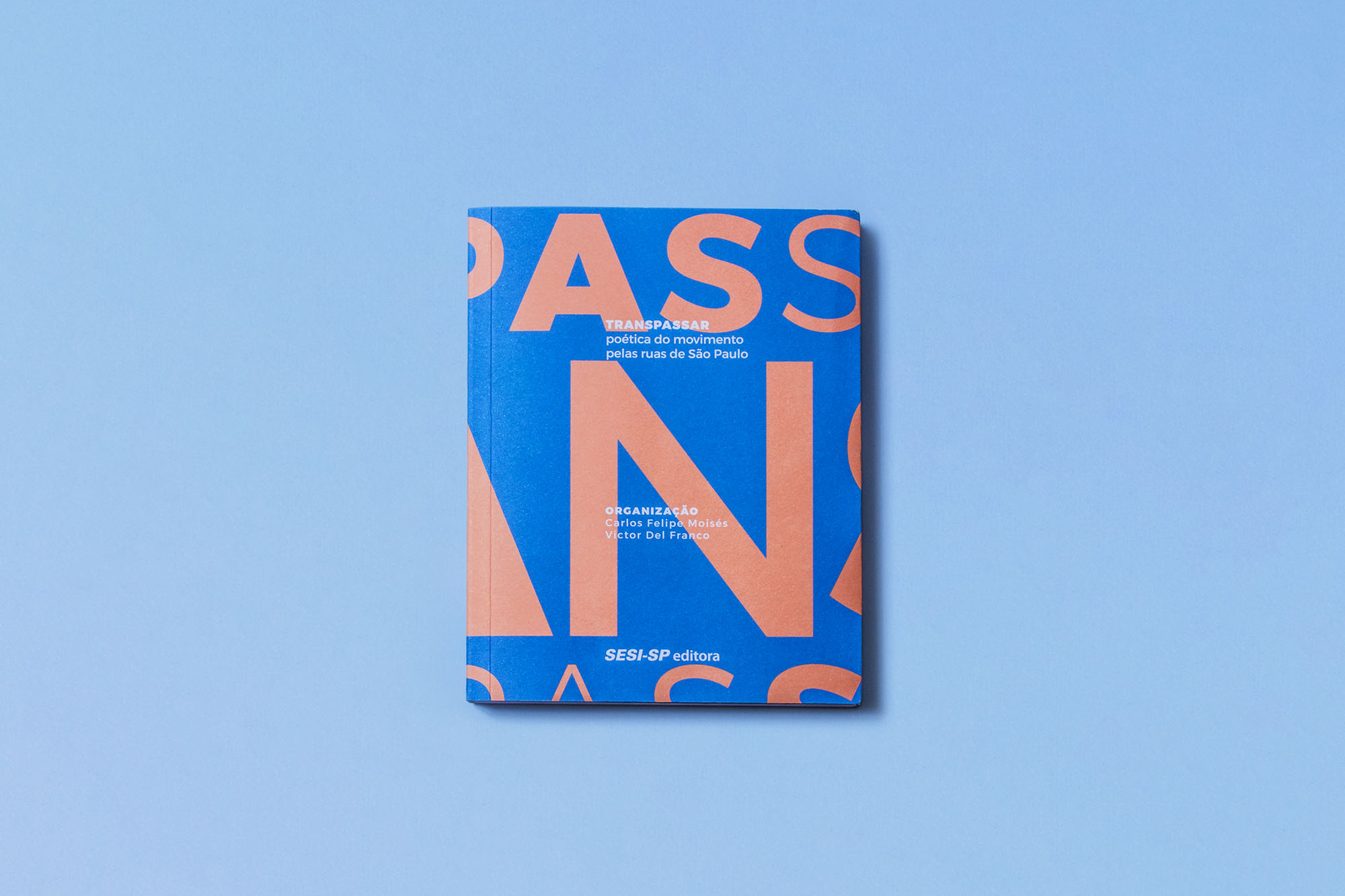
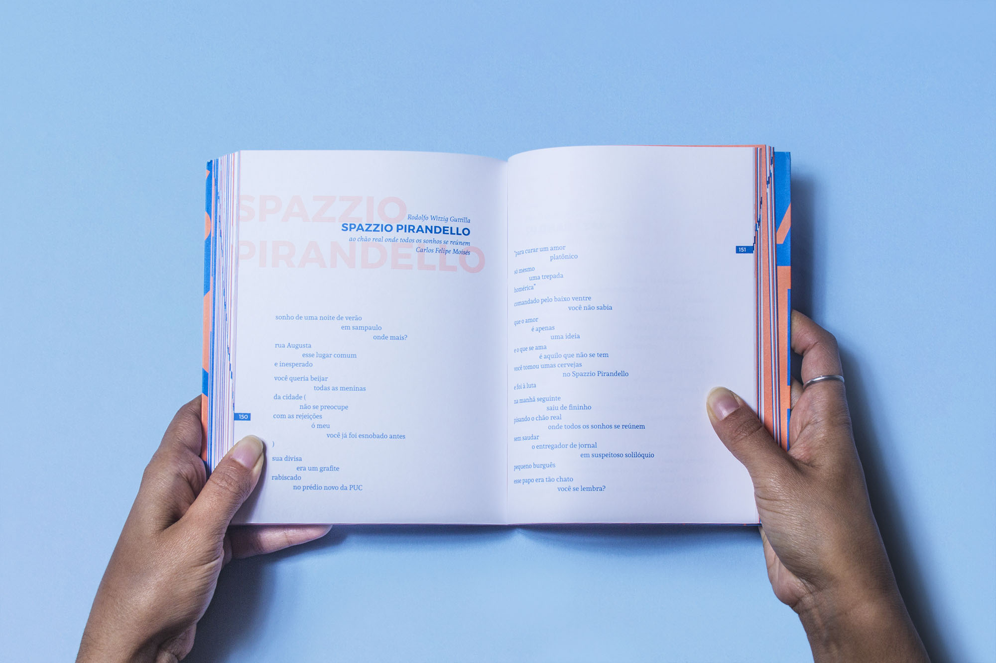
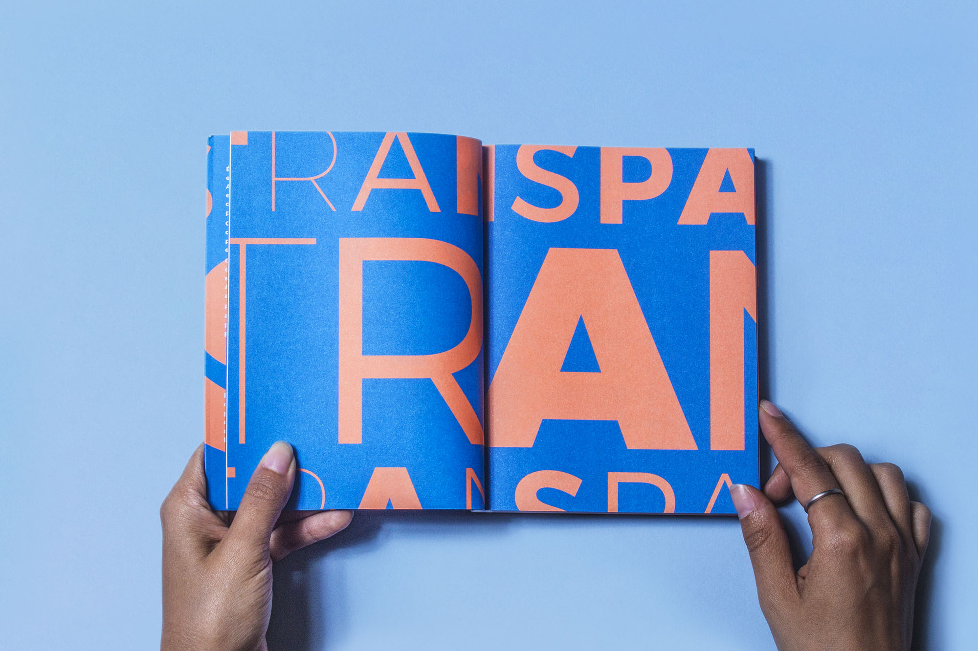
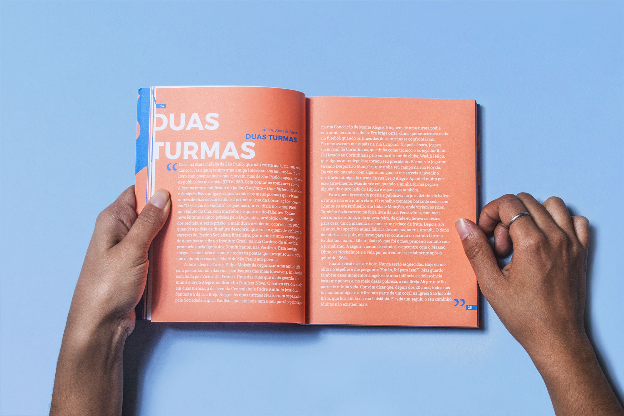
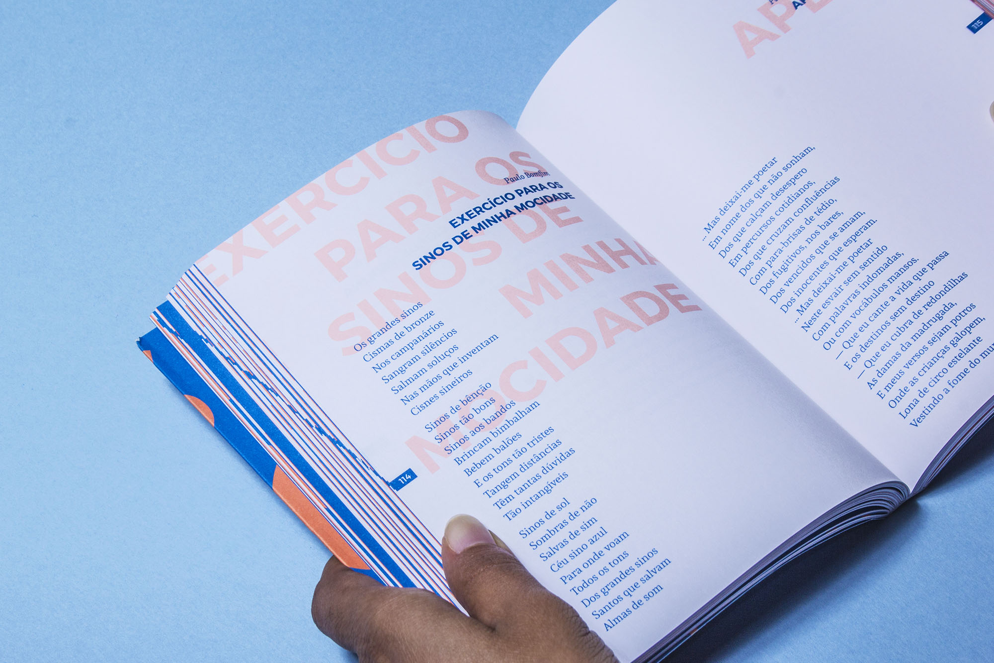
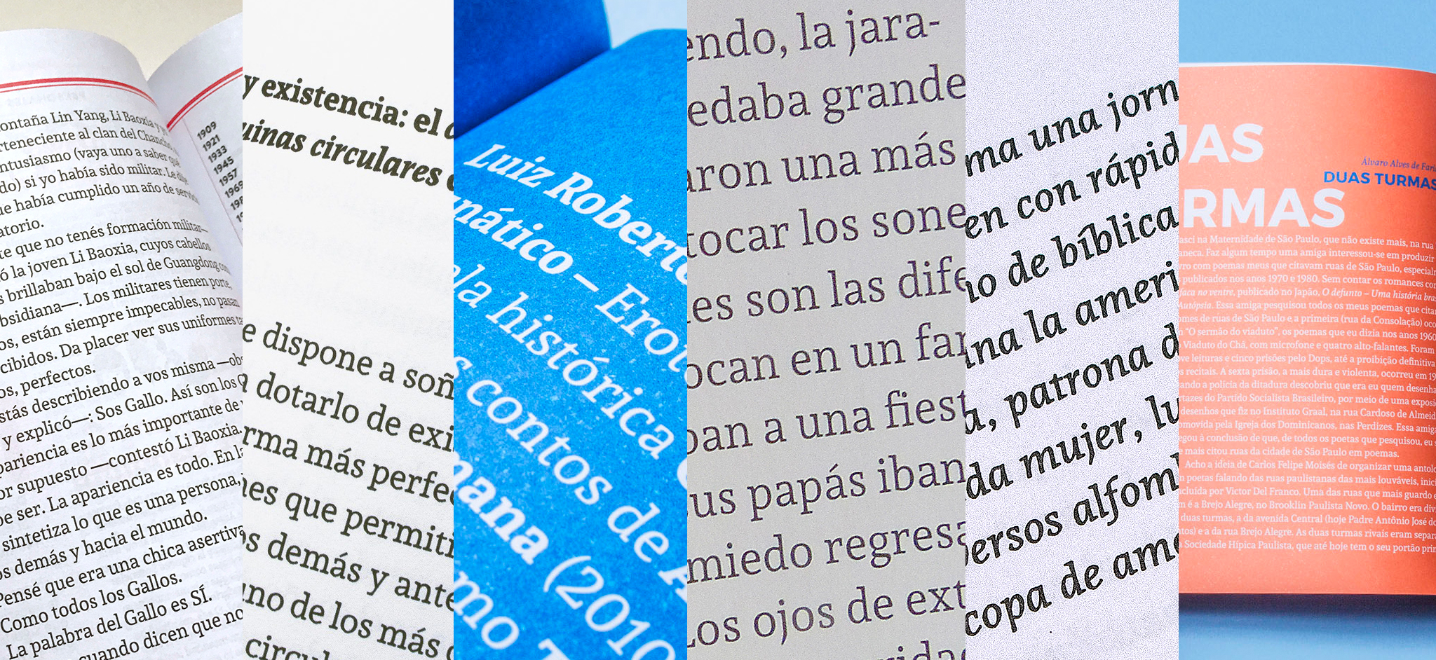
Book cover and interior pages for Transpassar, an anthology of poems about the streets of São
Paulo.
The book was published by SESI-SP Editora and designed by graphic design studio Daó and Gabriela Pires.
Andada + Montserrat
[fontsinuse]
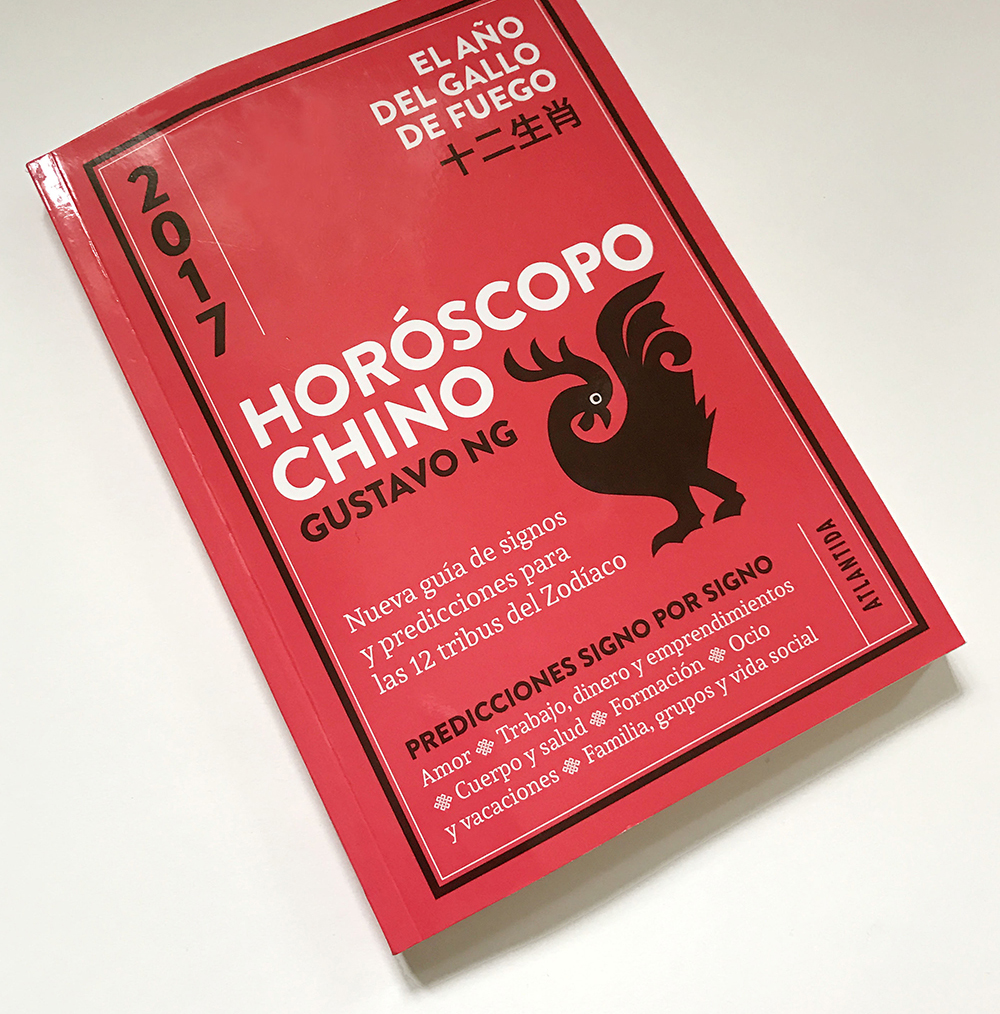
Editorial Atlantida. Designed by ZkySky
Andada + Brandon Grotesque + STHeiti.
[fontsinuse]
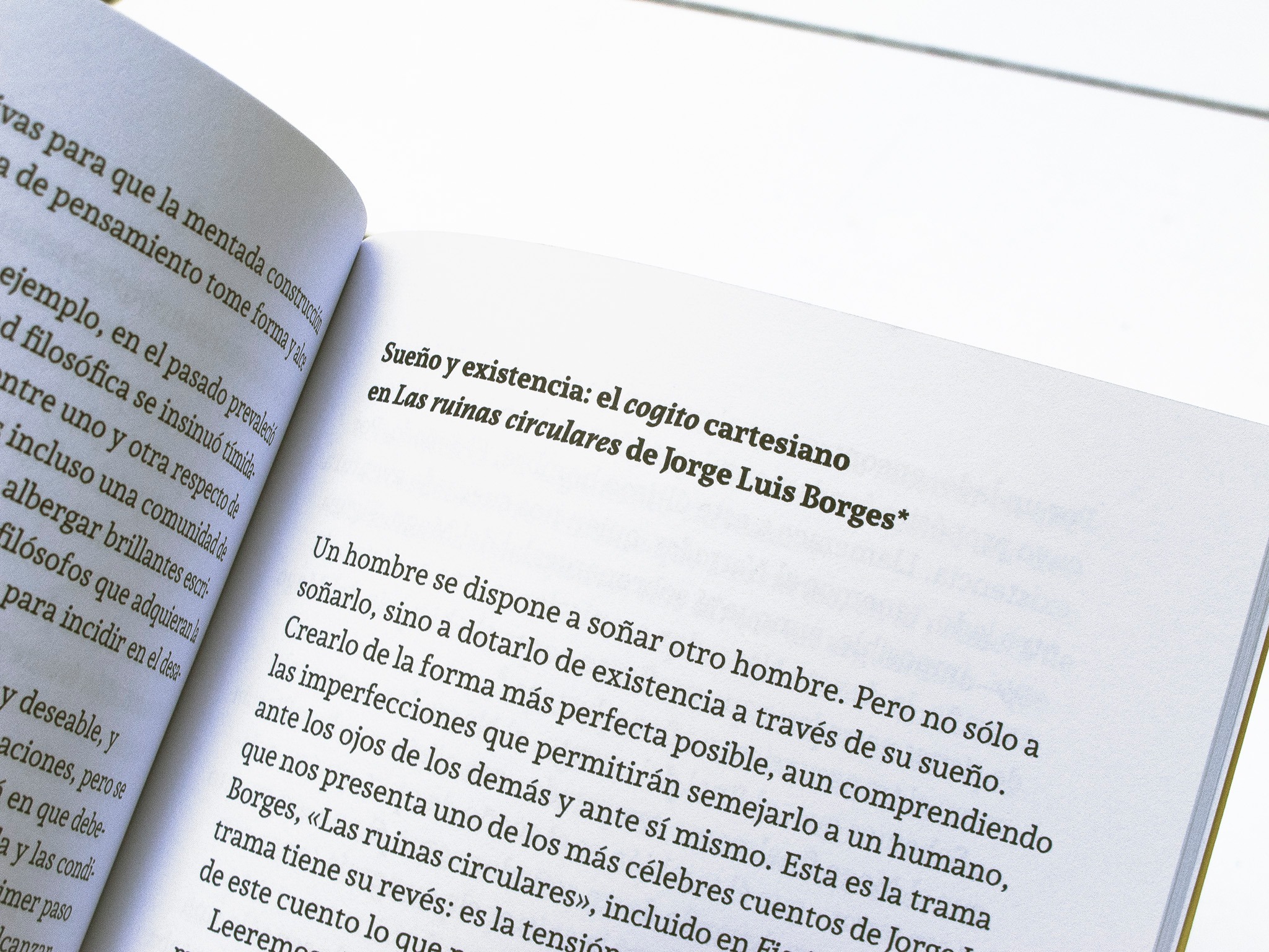
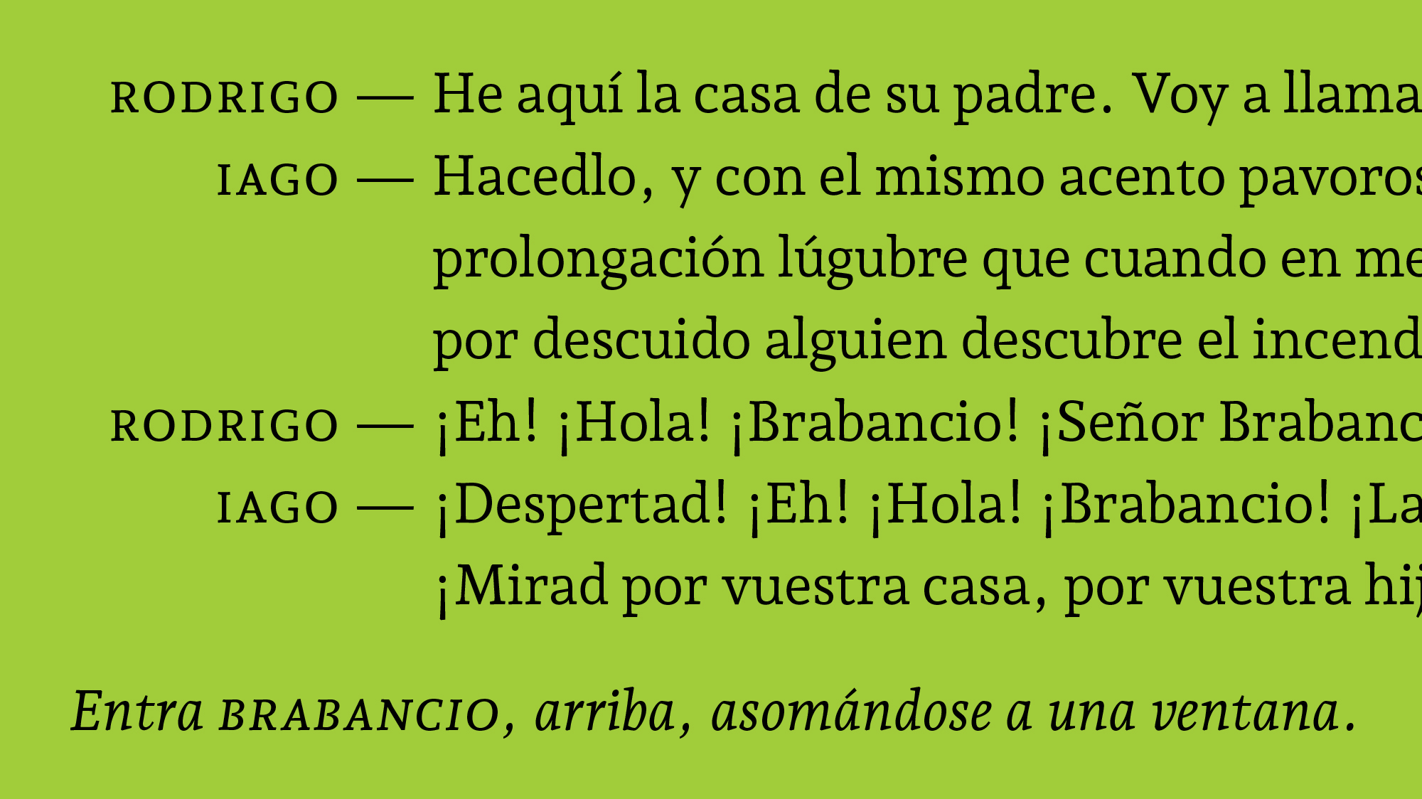
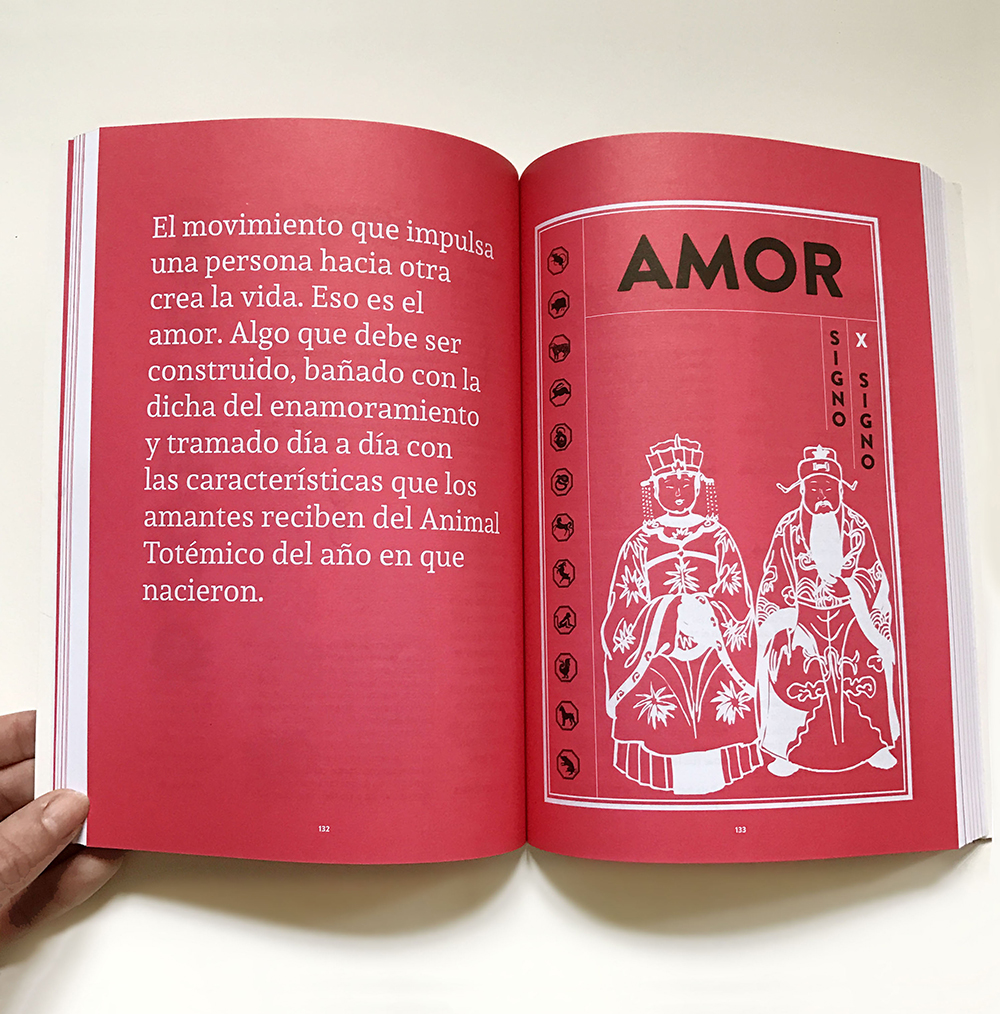
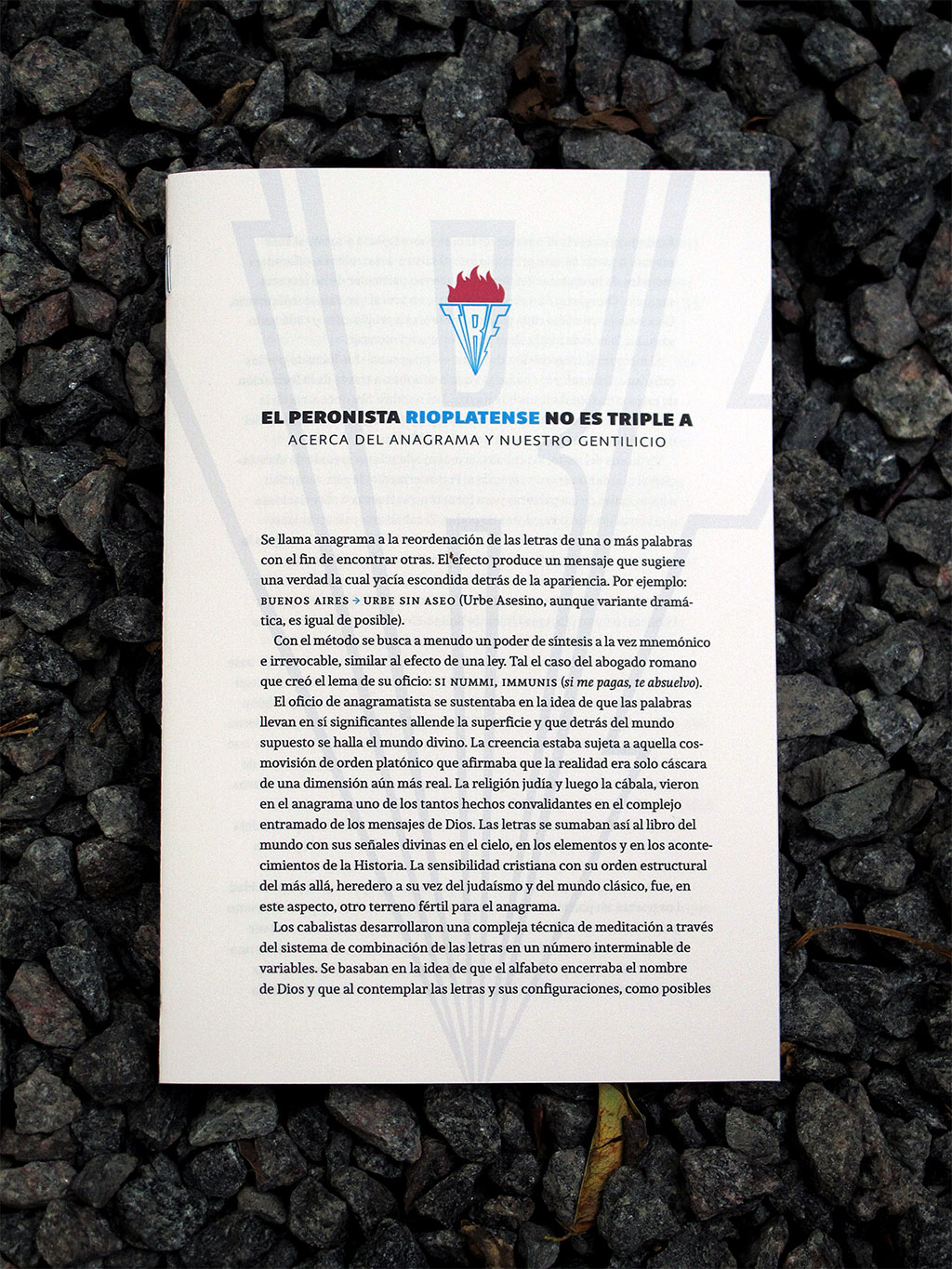
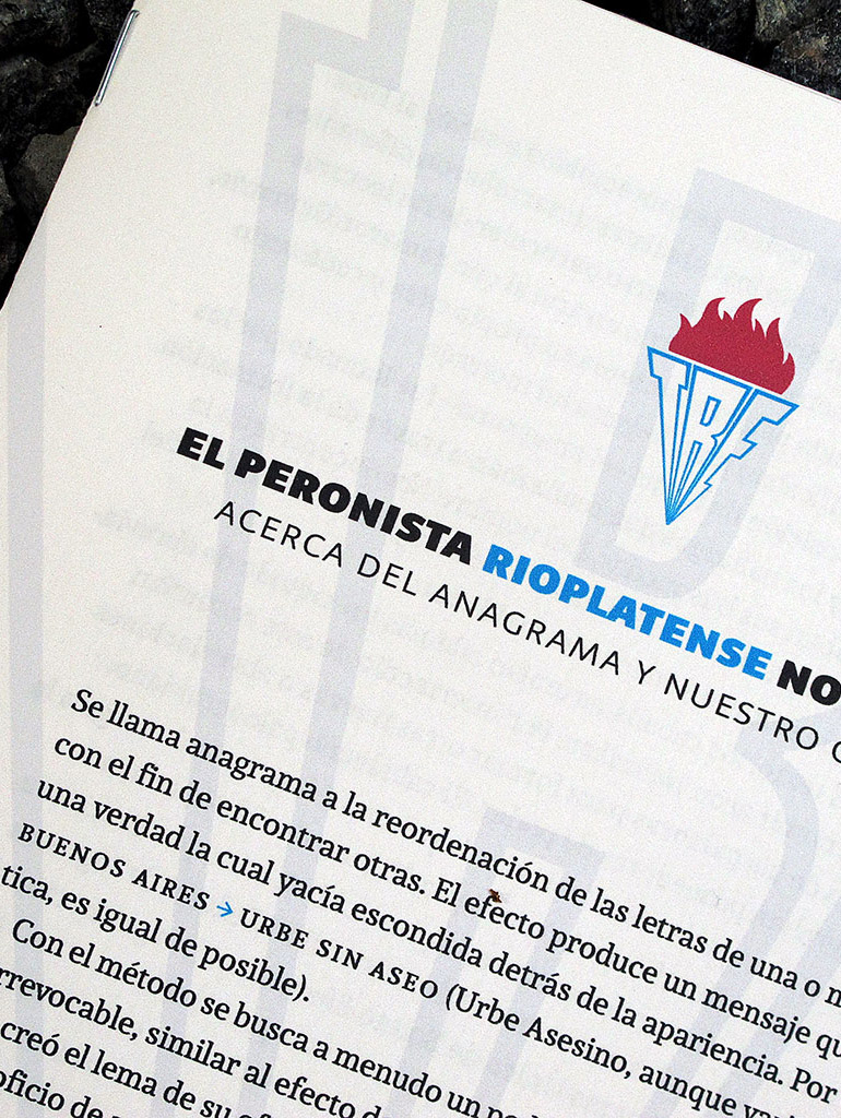
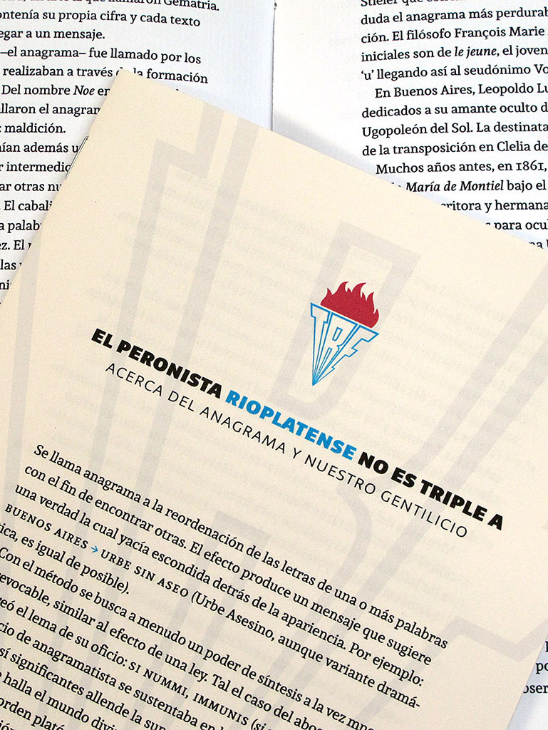
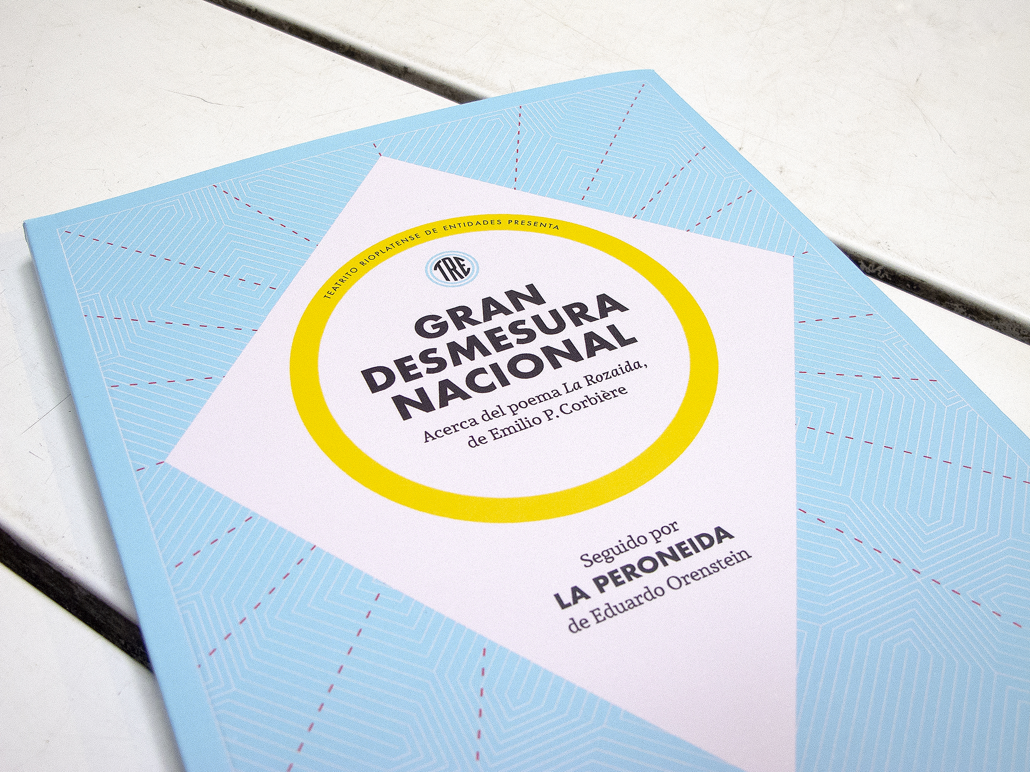
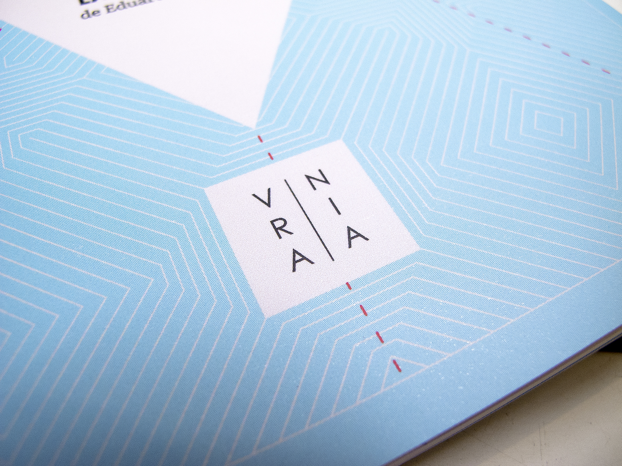
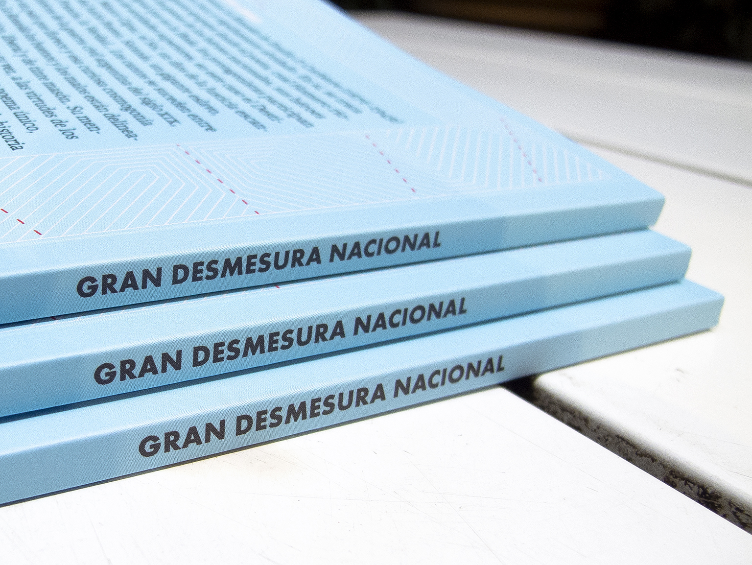
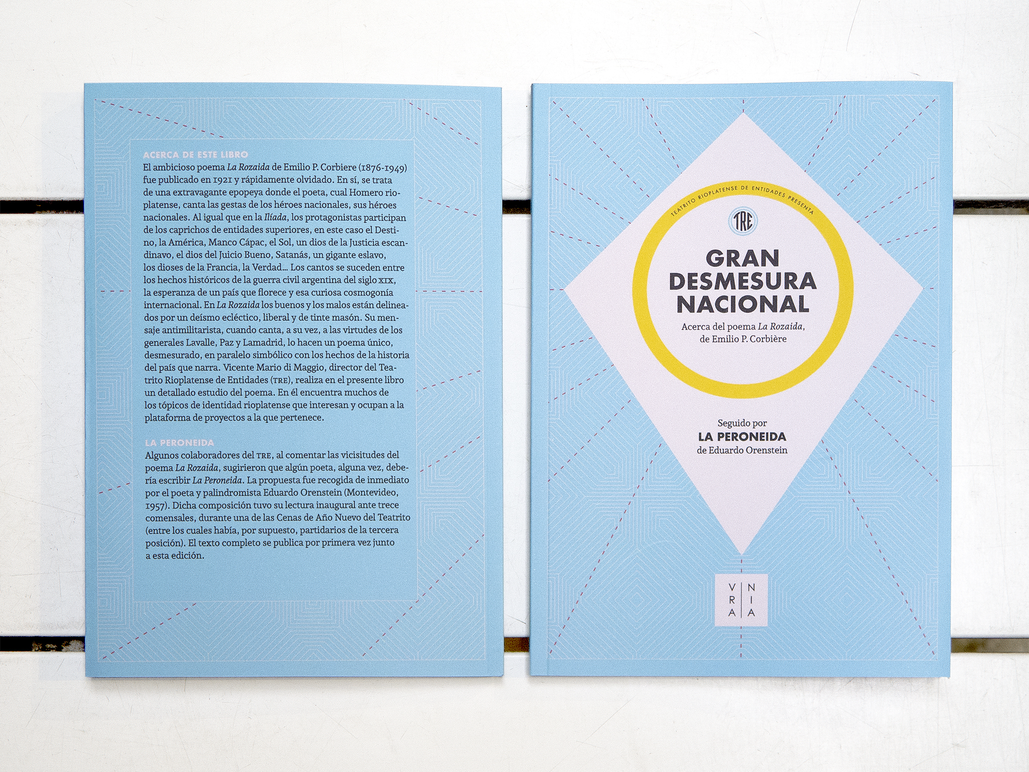
Ediciones Urania.
Designed by Gustavo Ibarra y Ral Veroni.
Andada + Futura
[fontsinuse]
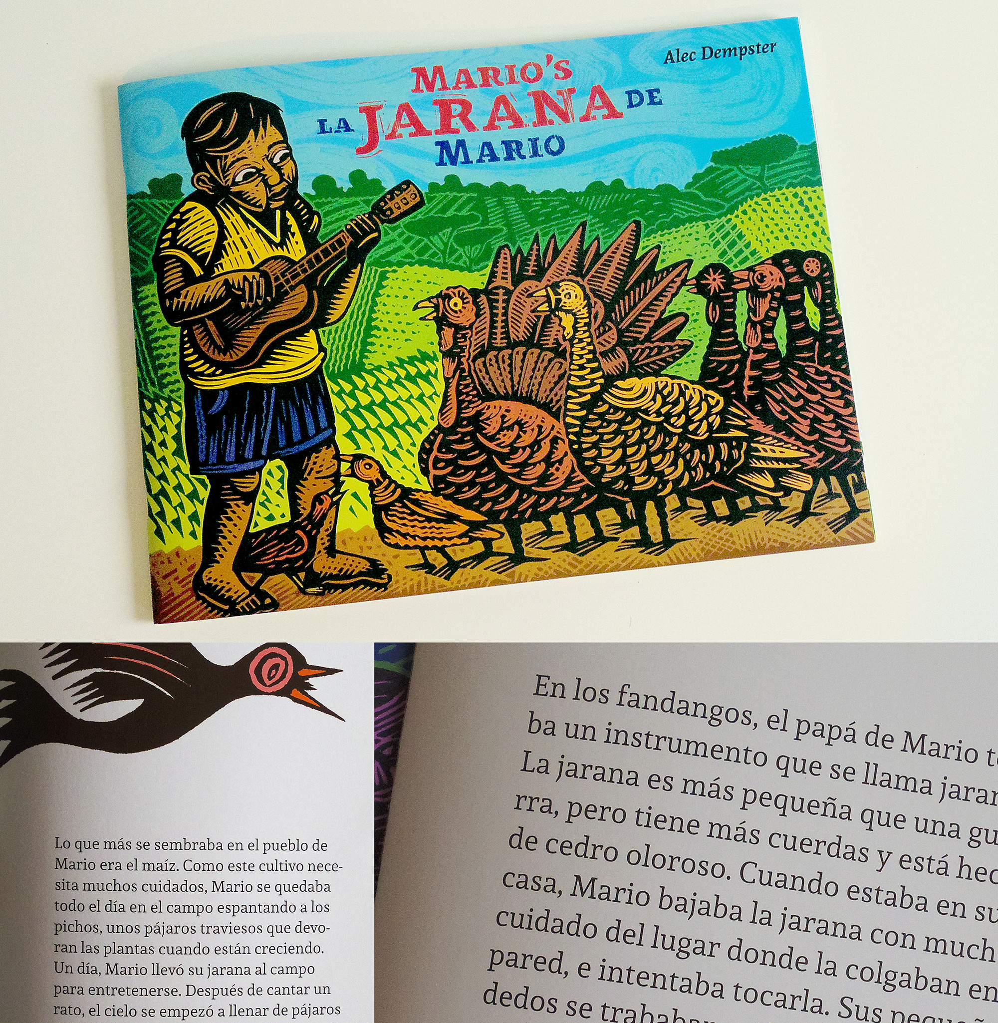
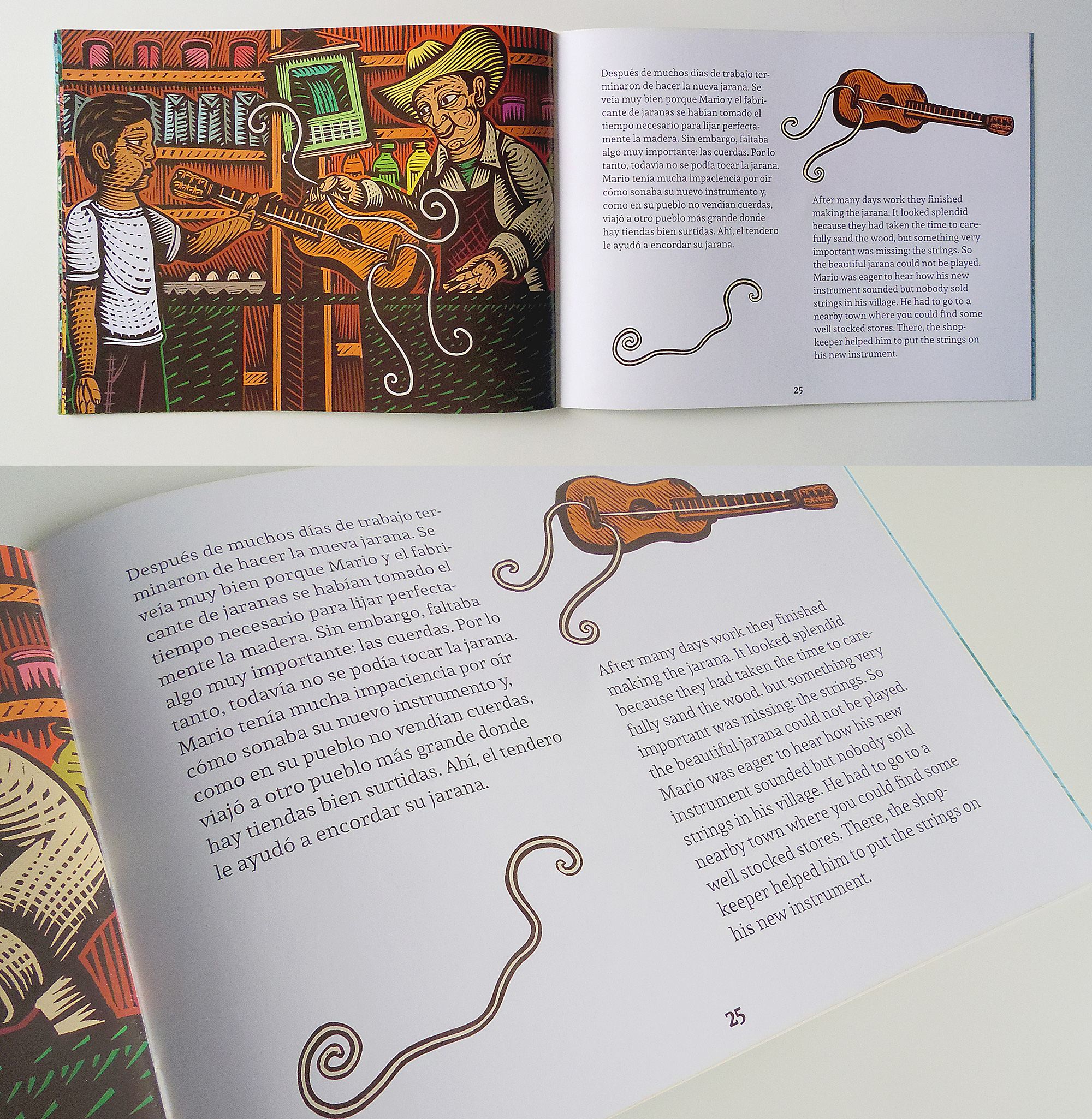
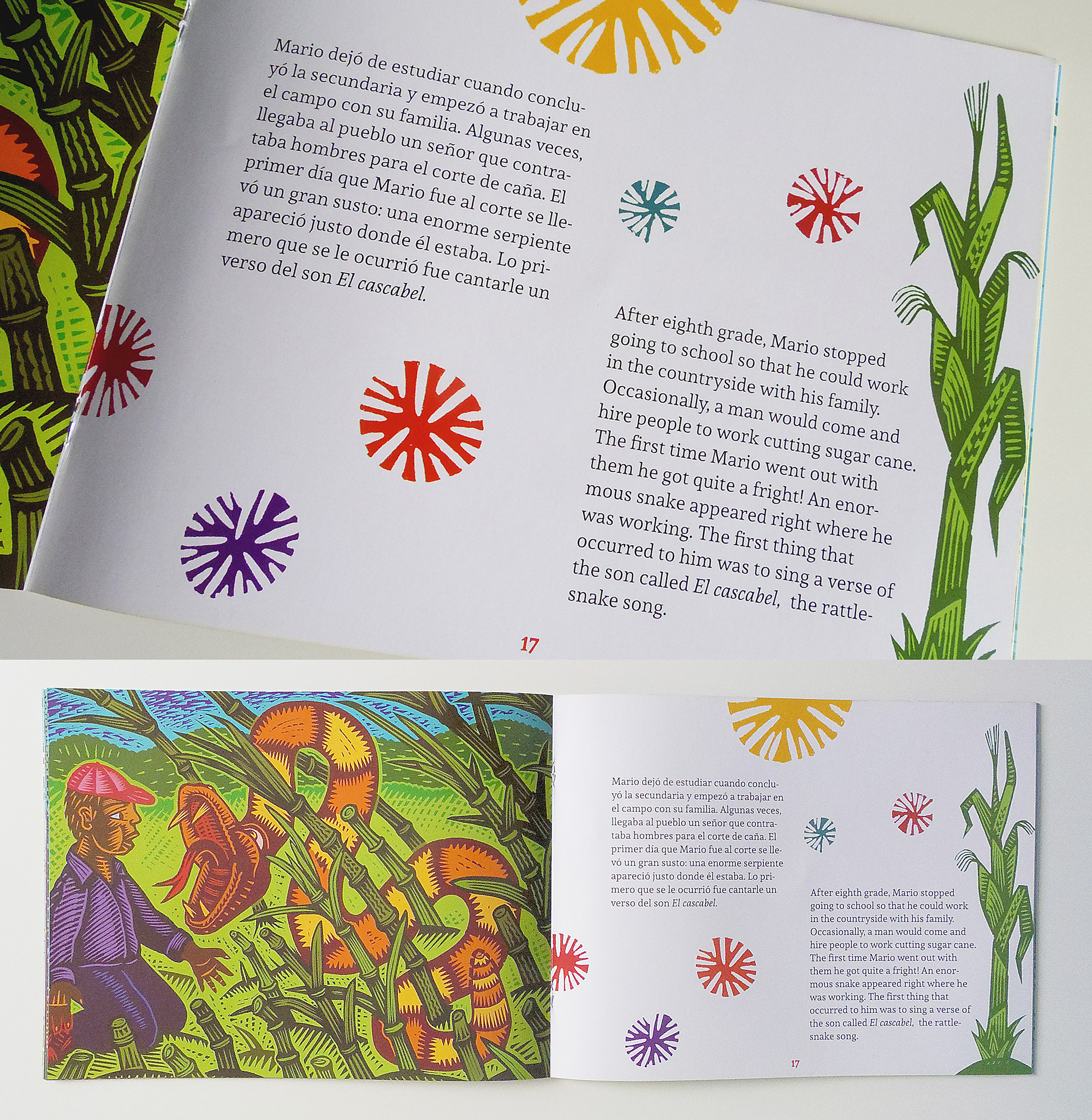
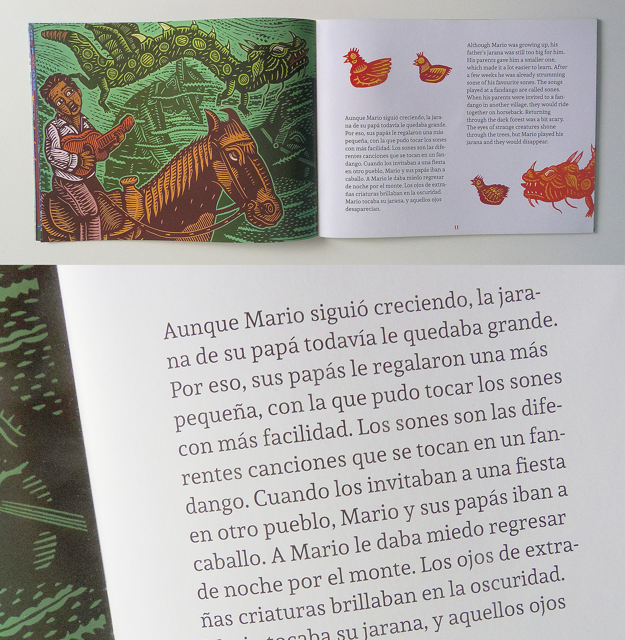
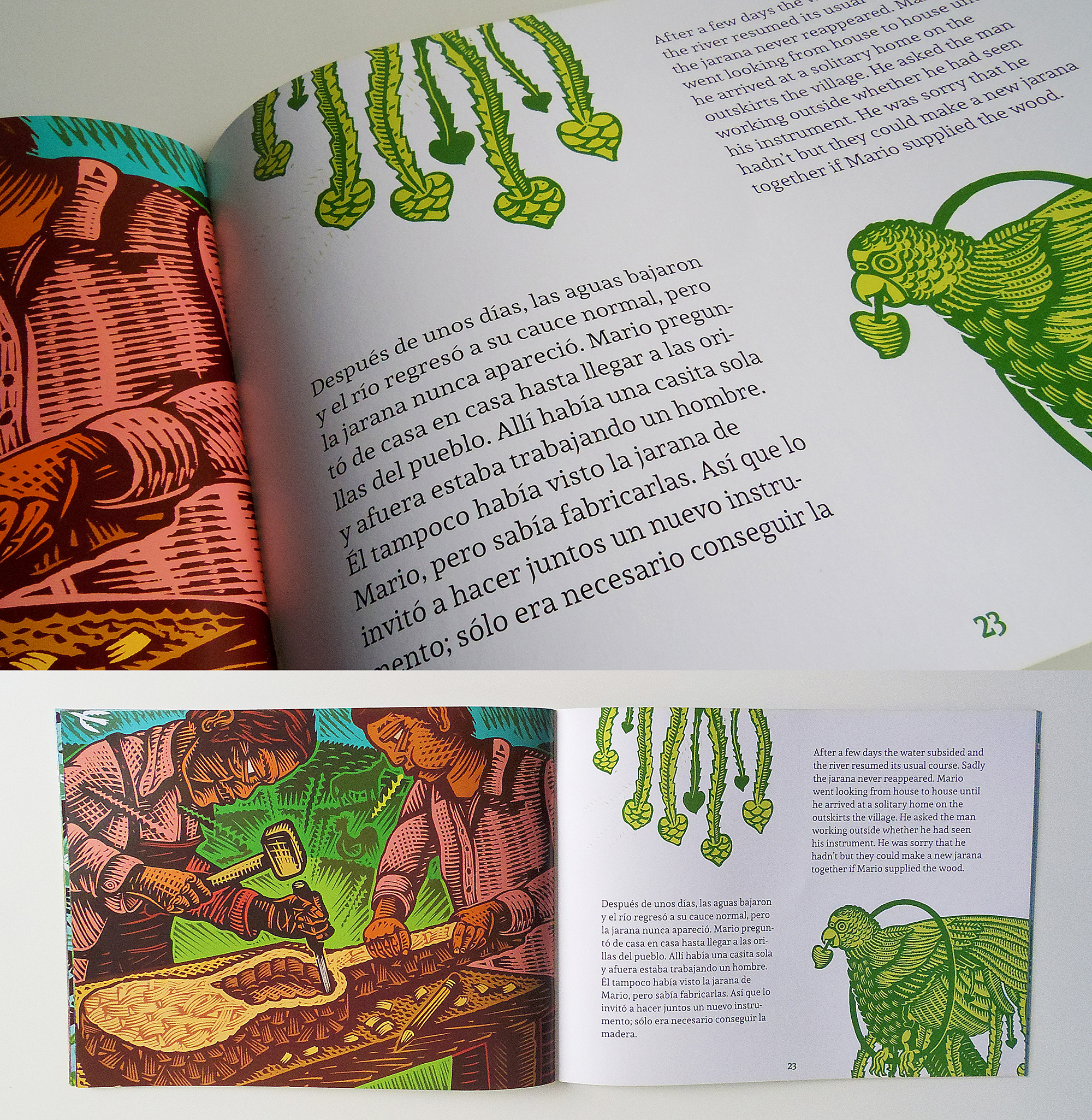
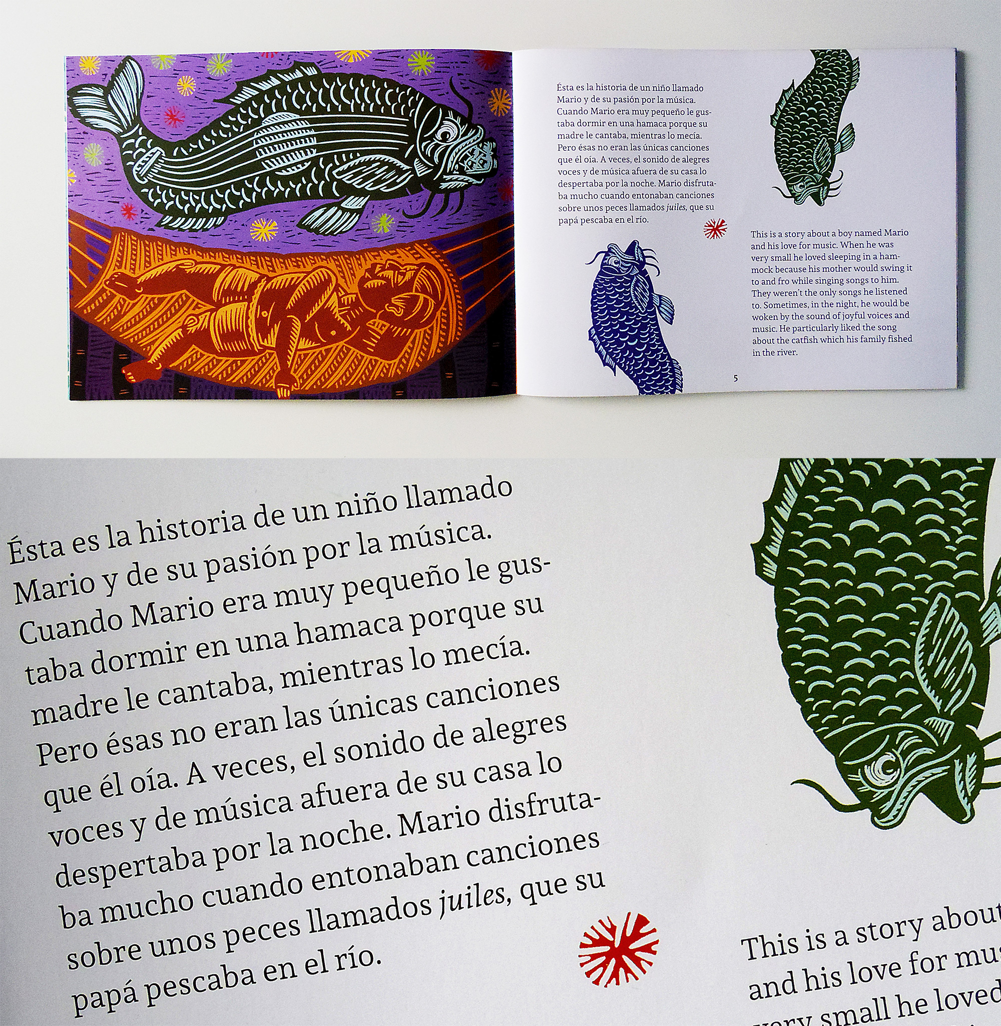
Designed by Alec Dempster and Manuel López Rocha.
Andada
[fontsinuse]
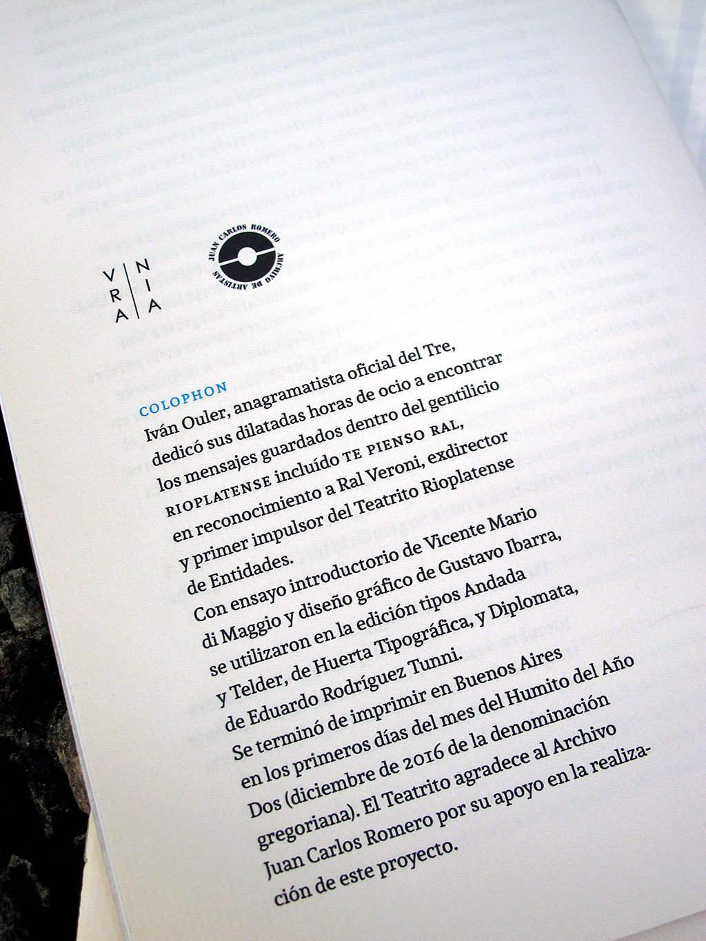
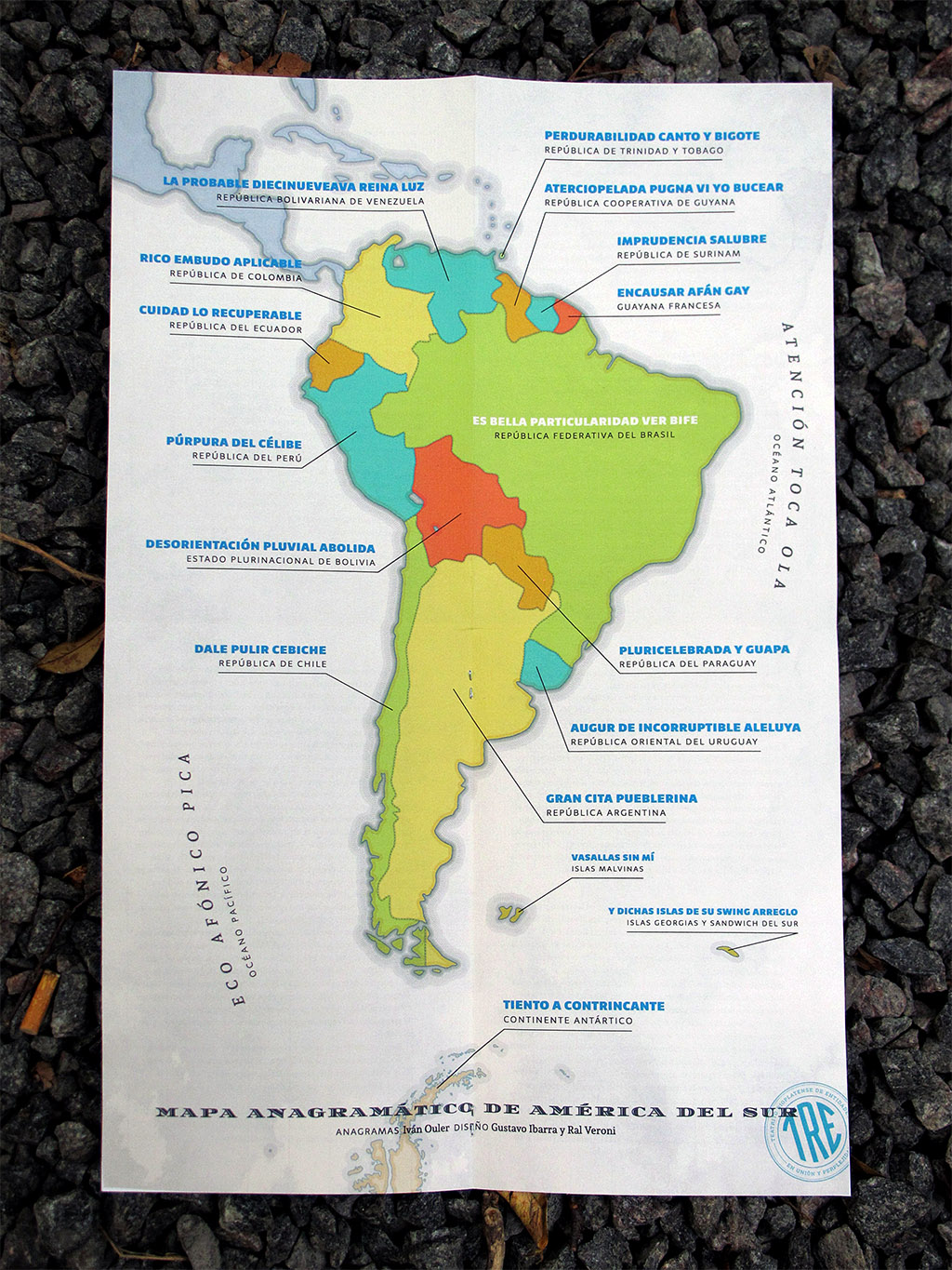
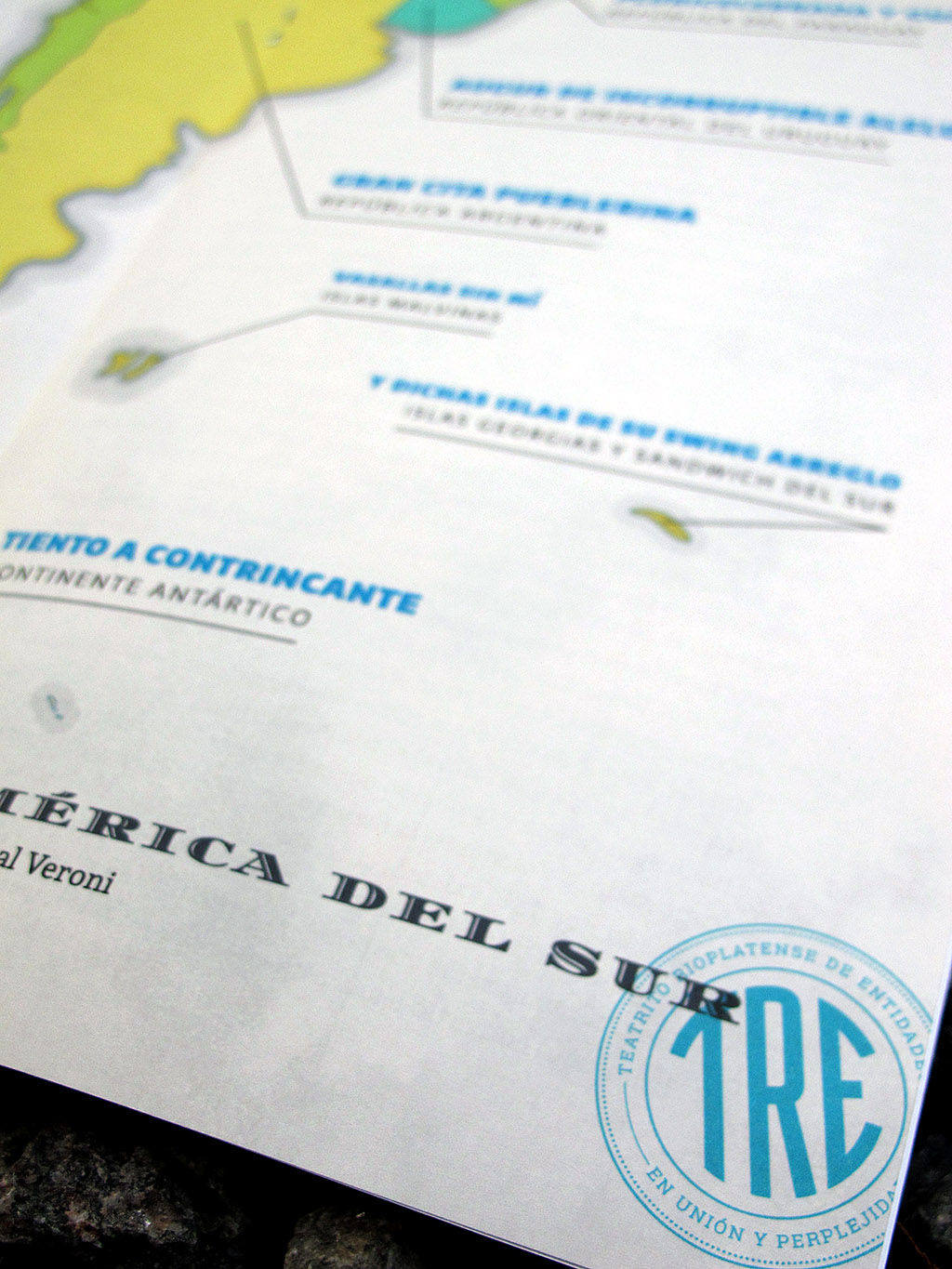
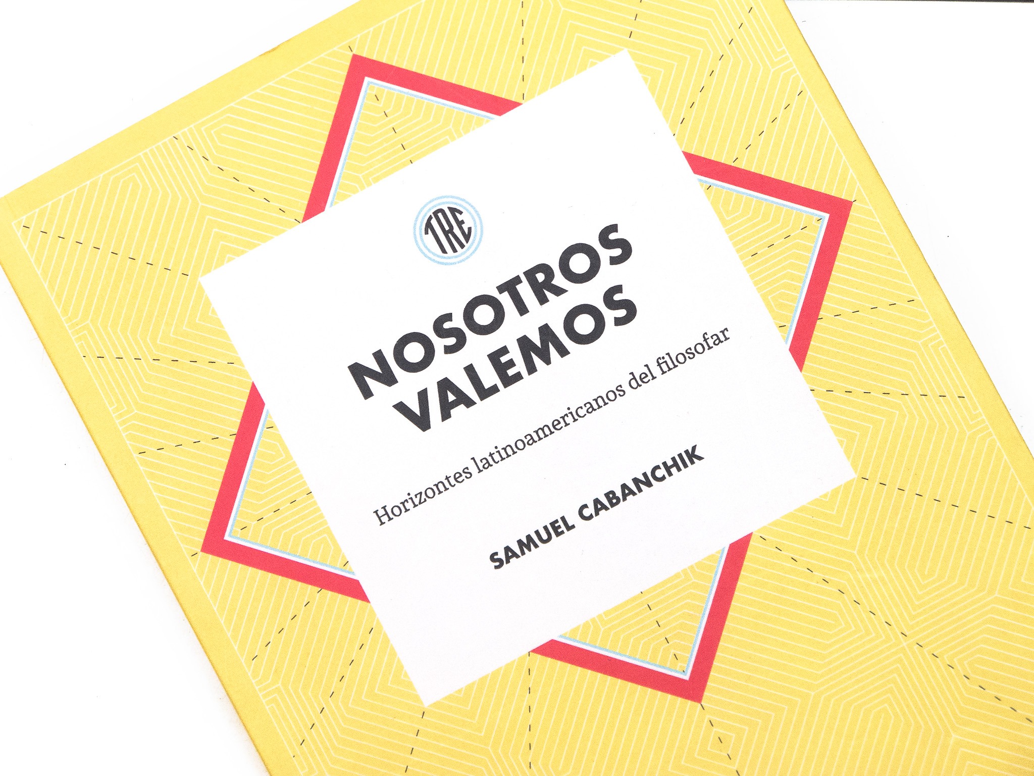
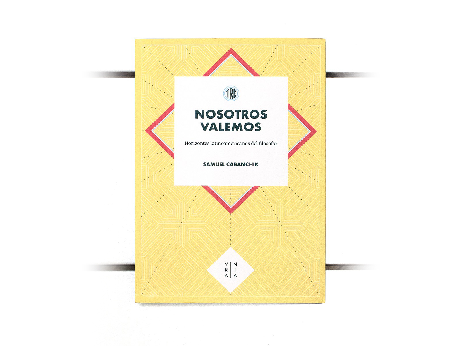
Ediciones Urania.
Designed by Gustavo Ibarra y Ral Veroni.
Andada + Telder + Diplomata
[fontsinuse]
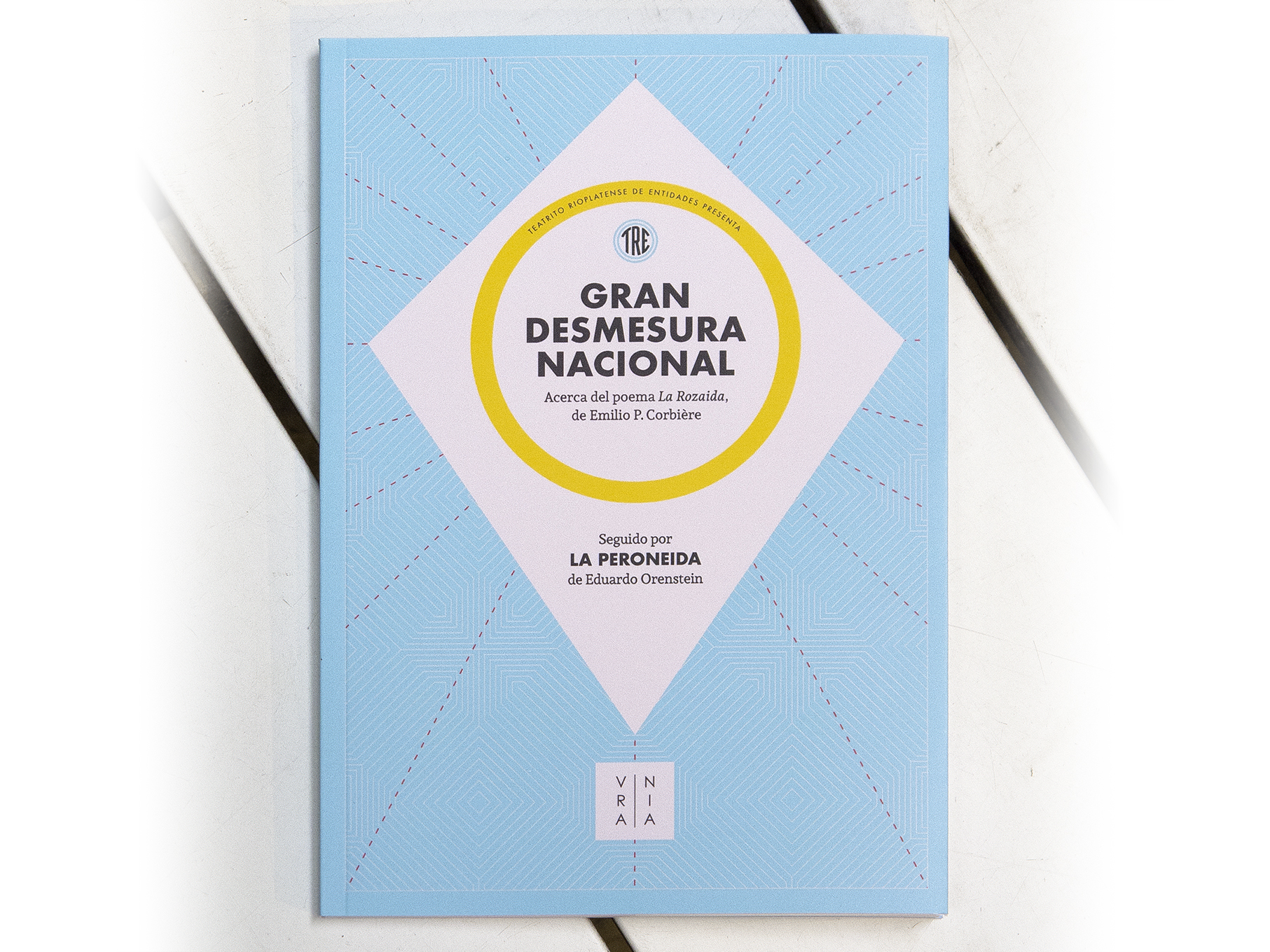
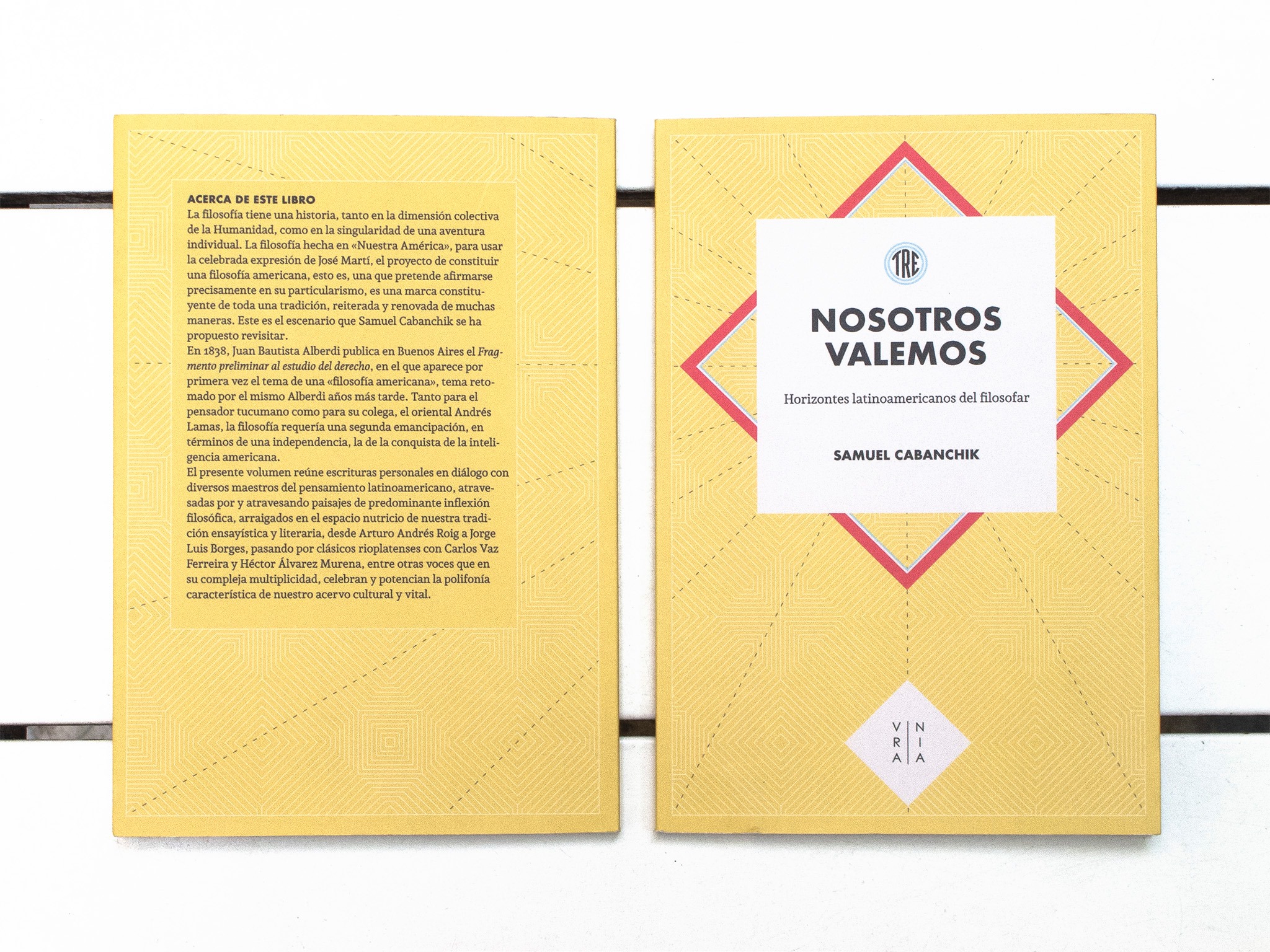
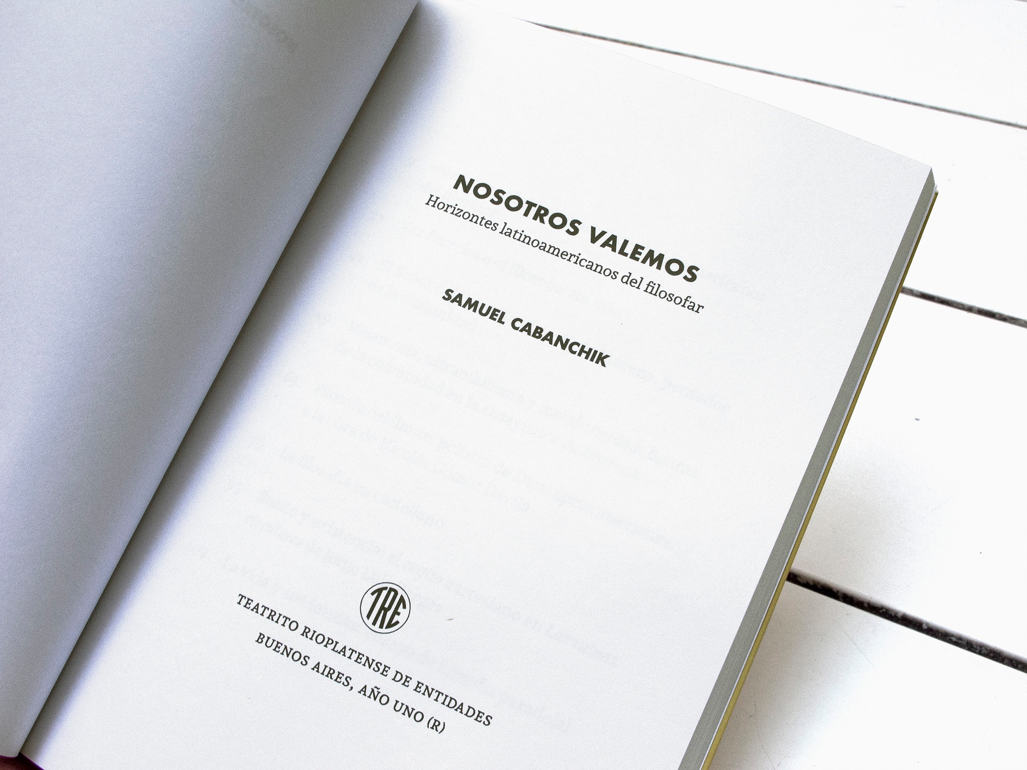
Ediciones Urania.
Designed by Gustavo Ibarra y Ral Veroni.
Andada + Futura
[fontsinuse]

© 2026 HT Fonts. All rights reserved.